Project Overview
Formus Labs
The Visibility Problem: Redesiging How Formus Listened
My role
Scope
Regulated Med-Tech | AI Software | B2B | SaaS
Problem
Internal teams were siloed, prioritizing immediate technical fixes and rigid regulatory compliance over a cohesive, user-centered product strategy.
Key contribution

my Impact as a Product Designer
Beyond the interface, I drove a massive cultural shift by designing and facilitating over 18 interactive, cross-functional workshops that forced engineering and leadership to physically empathize with the surgeon's end-to-end journey.
I also led a feedback strategy to align the company on gaining and prioritising proactive as well as reactive feedback, so valuble insight wasn't lost or deprioritised to more immediate techincal fixes.
1
6
4.9
2
Accelorated new feature integration delivery time by ~2 months
18+
Conducted 18+ cross-functional workshops to align the team on 'product led' thinking.
4
Led feedback strategy to align 4 key departments on proactive feedback plan and meet CAPA requirements
Constrains & trade-offs
A significant strategic trade-off involved fighting to divert engineering resources away from highly visible technical risks in order to address longstanding UX pain points raised by customer service.
Commercial OutcomeS
This alignment of user needs with business goals culminated in the CEO officially declaring Formus Labs a "Product-Led Company".
Feedback began to turn from reactive bug fixing mentality, to forward looking, planned feature delivery with measureable impact on customer satisfaction.
Key Learnings & Outcomes
I also proved that frameworks only survive if they simplify people's jobs, demonstrating that active team participation beats passive persuasion when securing stakeholder buy-in.
Formus Labs
The Visibility Problem: Redesiging How Formus Listened
Regulated Med-tech
B2B | SaaS | AI software
30%
6
4.9
2
Accelorated new feature integration delivery time by ~2 months
18+
Conducted 18+ cross-functional workshops to align the team on 'product led' thinking.
4
Led feedback strategy to align 4 key departments on proactive feedback plan and meet CAPA requirements
Formus Hip is an AI-driven planning tool used by surgeons preparing for joint replacement surgery. When I joined, the product was clinically valuable but the overall experience was fragmented.
User feedback was limited, often anecdotal rather than validated. Research was happening, but theoretical and disconnected from competitor realities. Engineering tended to prioritise issue-fixing over strategic product direction, and most teams were still unfamiliar with product-led or user-centred approaches.
Over the past two years, my role was to redesign core parts of the software and introduce new planning features, but I also aimed to shift the organisation toward a shared, user-driven mindset. I worked to build a scalable product foundation to help engineering, quality, and CX teams shift toward evidence-driven, user-first decision-making. This transformation took time, but we began to see a real cultural shift toward prioritising surgeon needs and more cohesive product strategy.
the Software
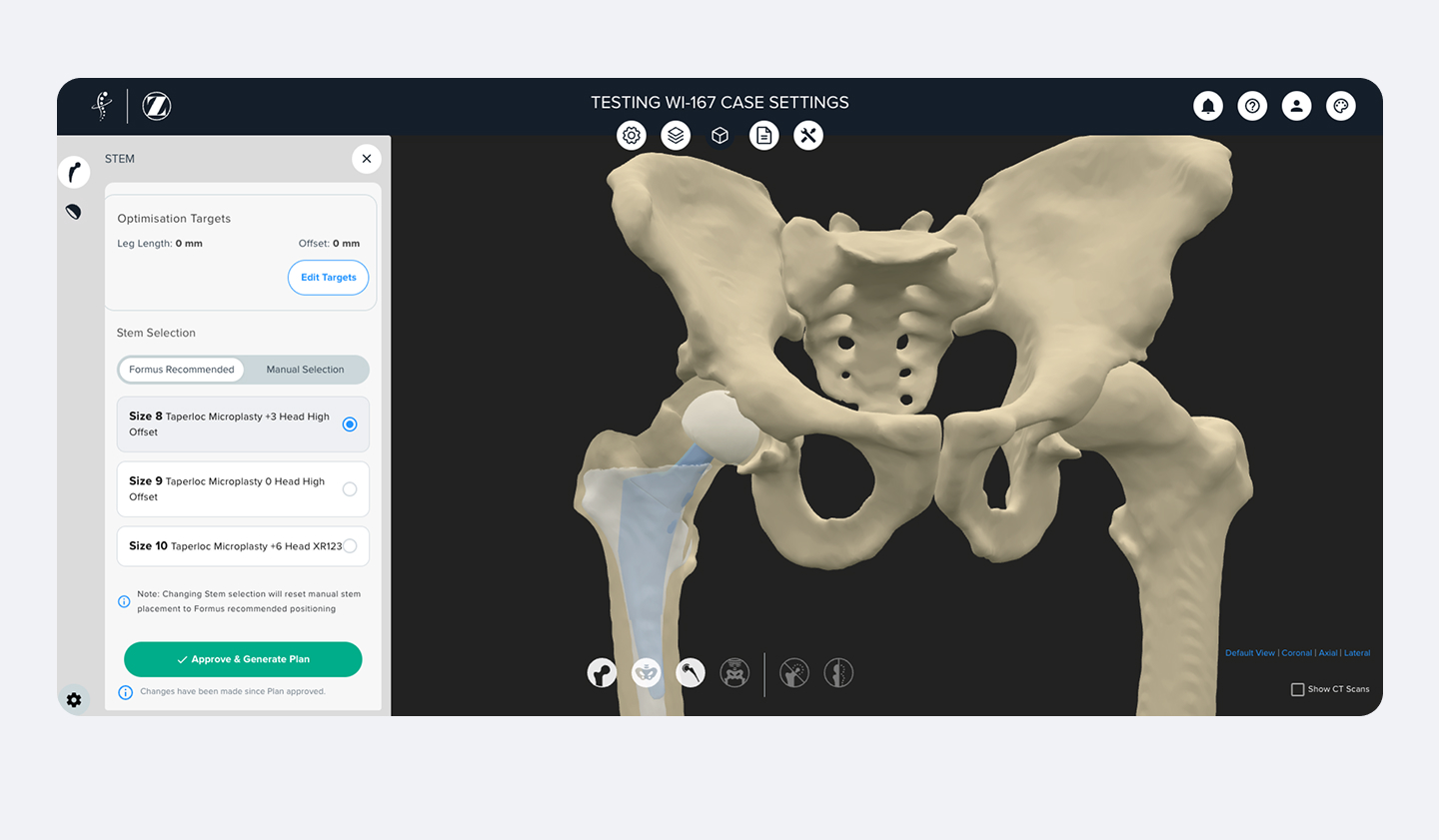
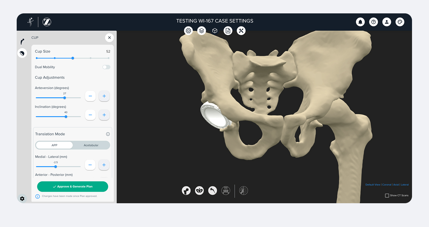
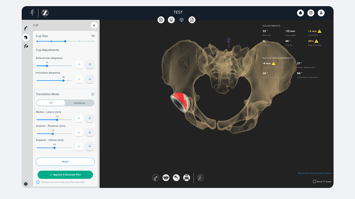
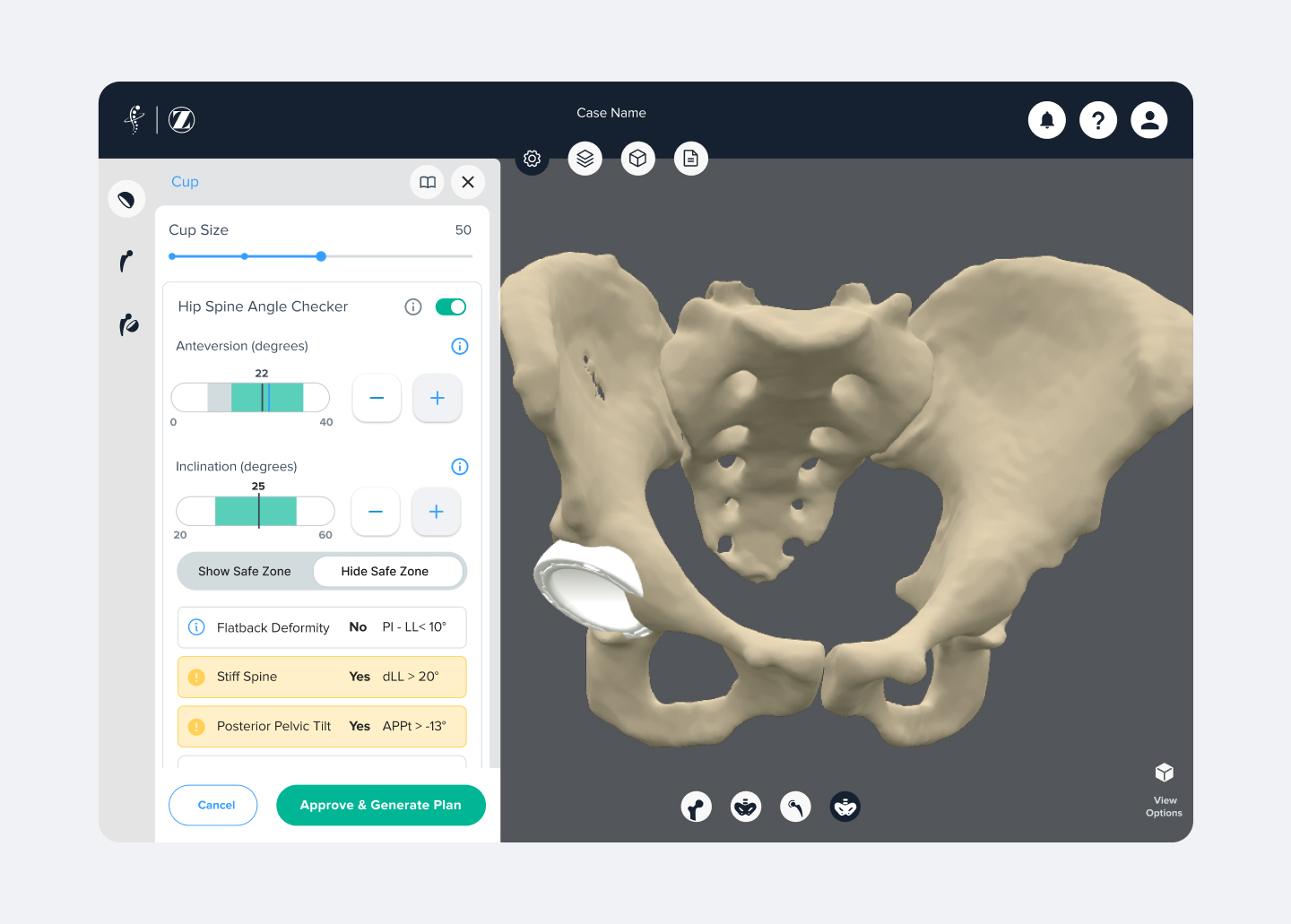
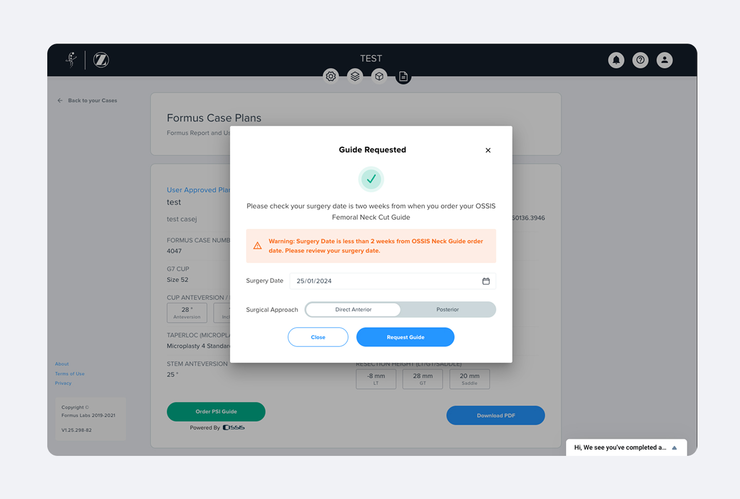
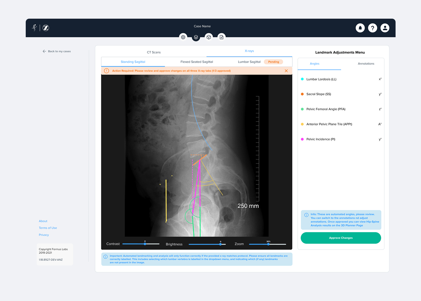
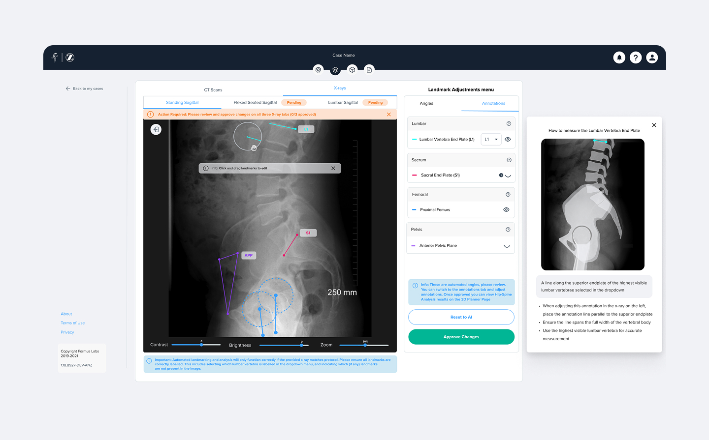
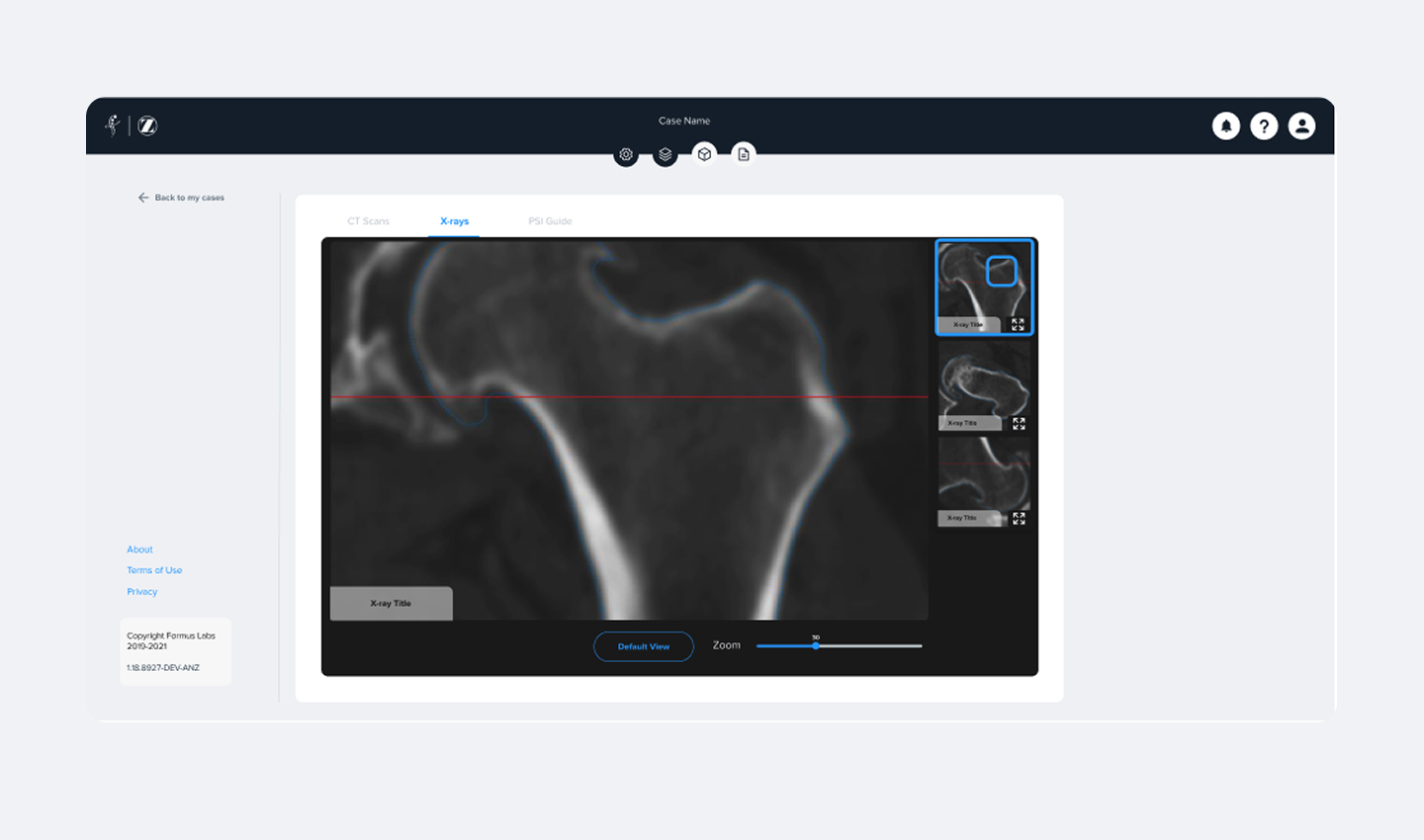
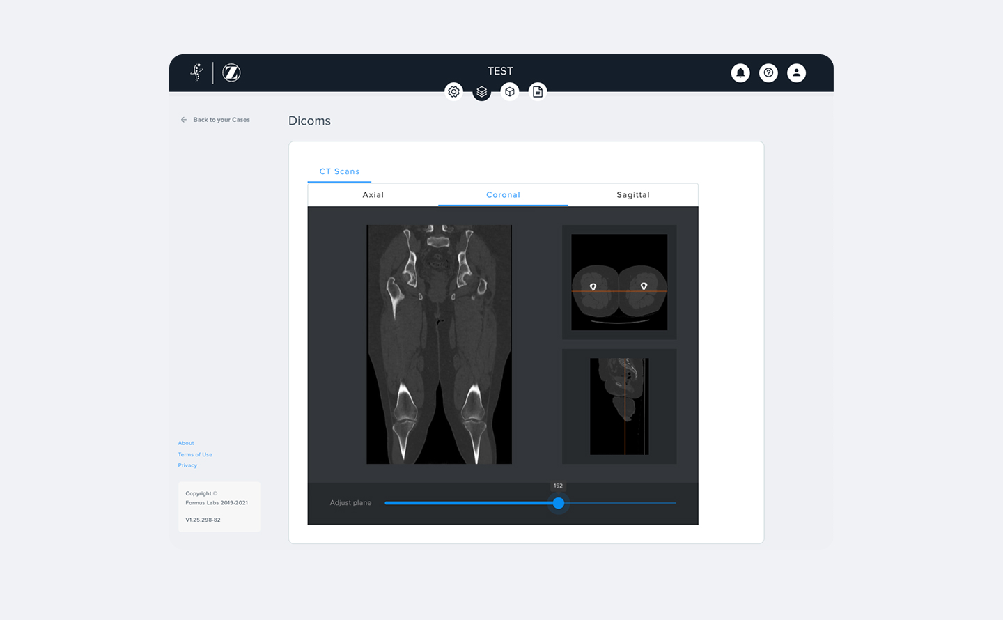
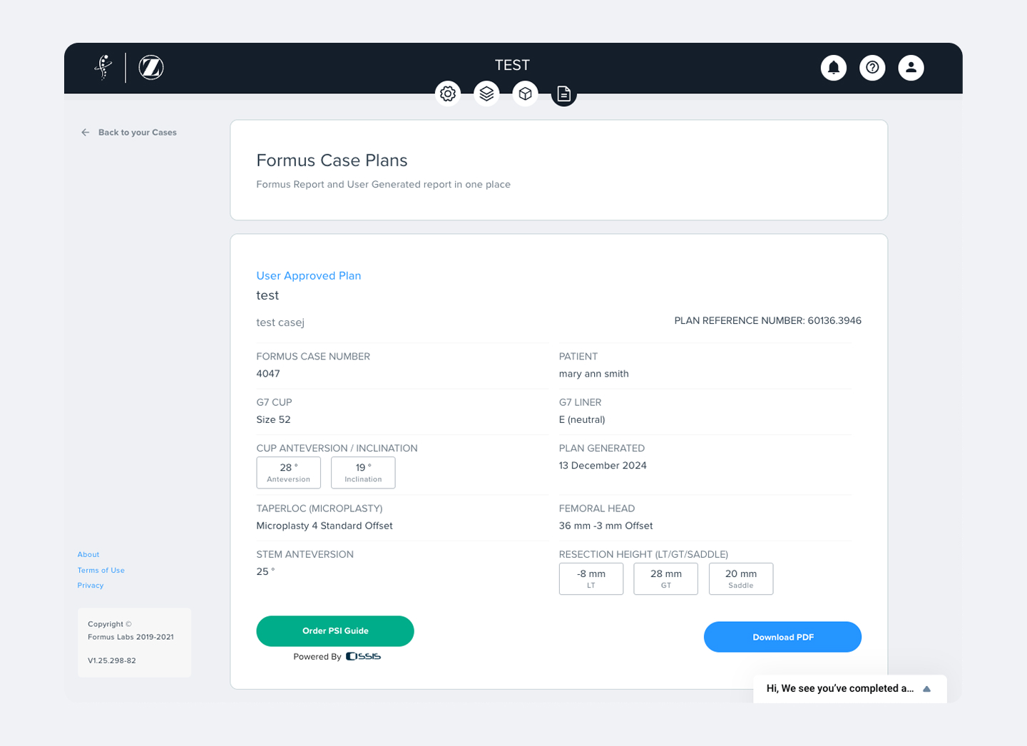
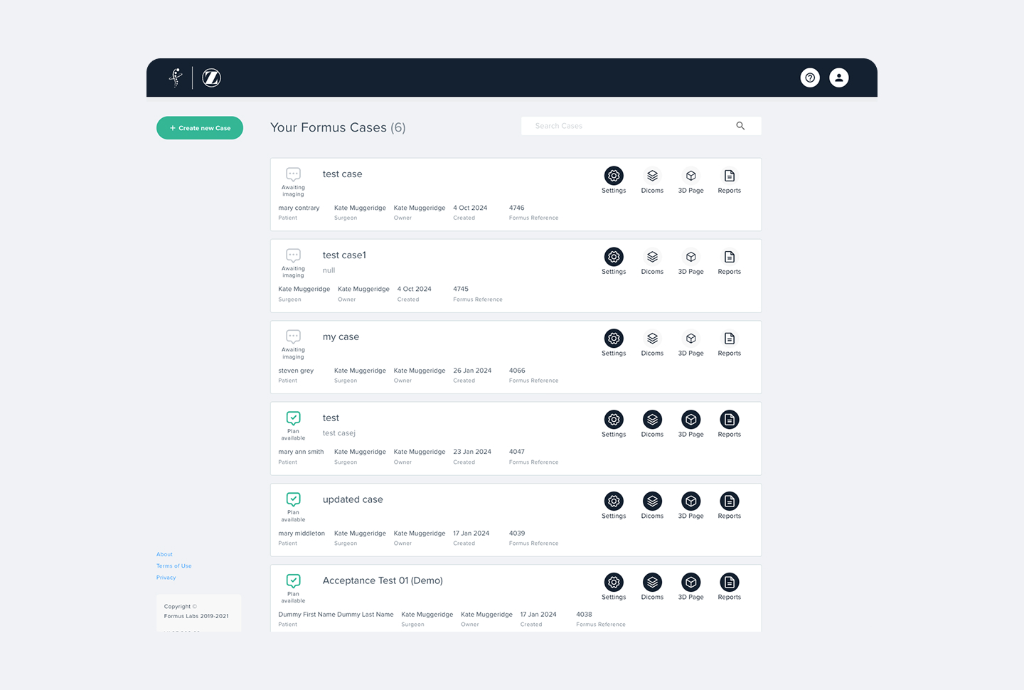
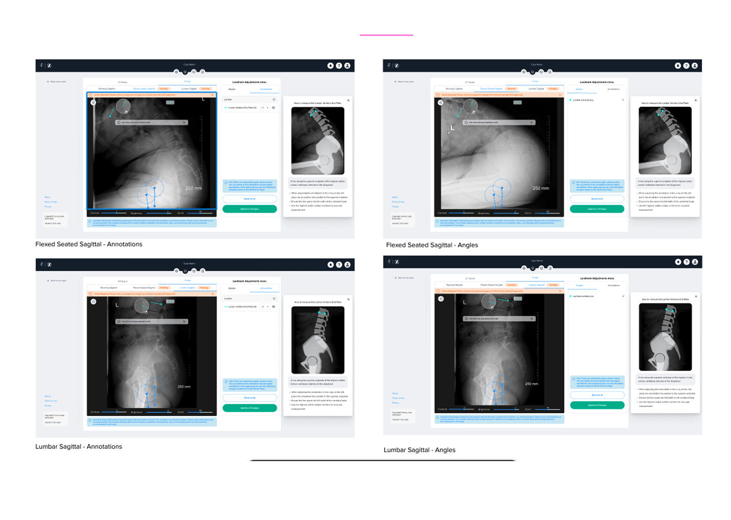
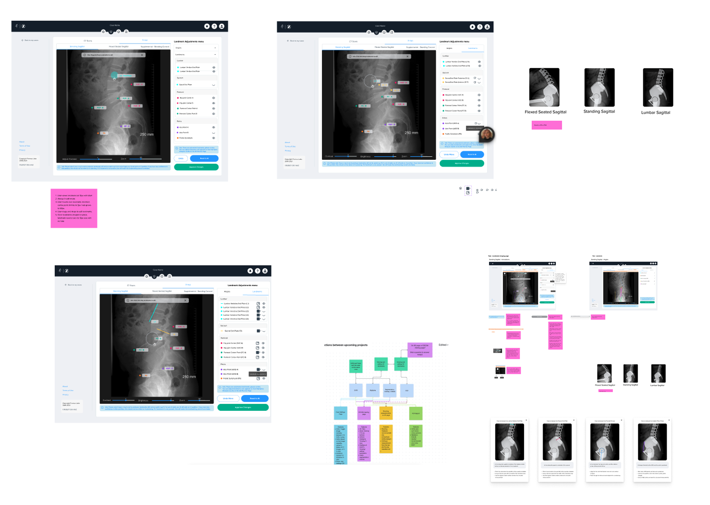
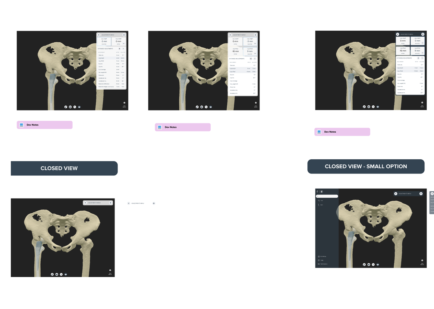
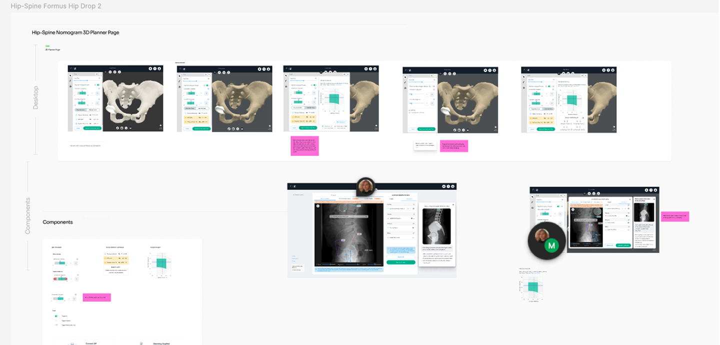
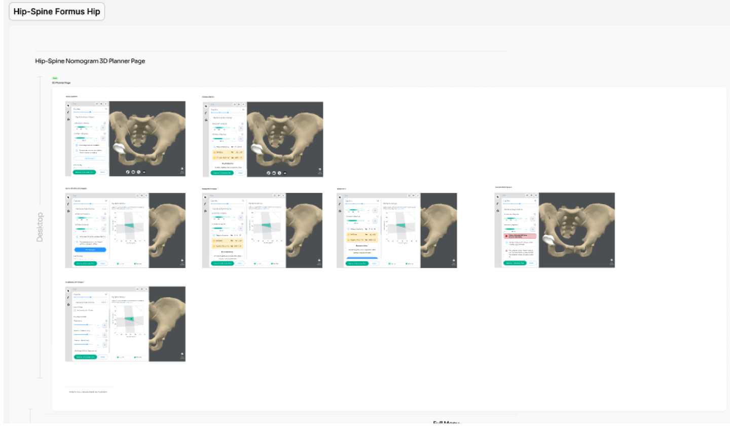
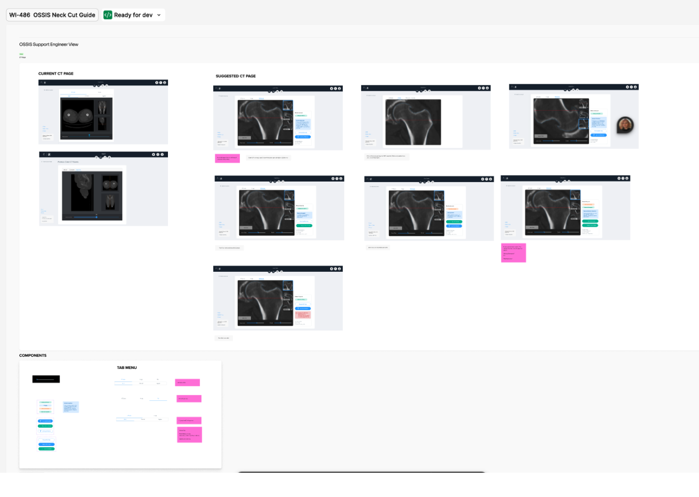
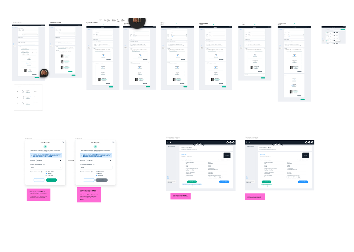
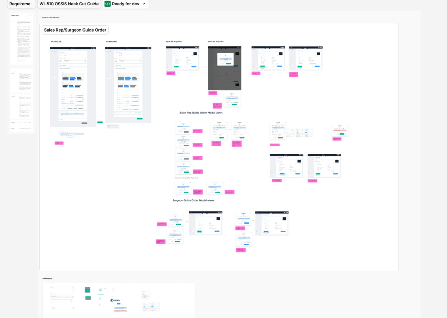
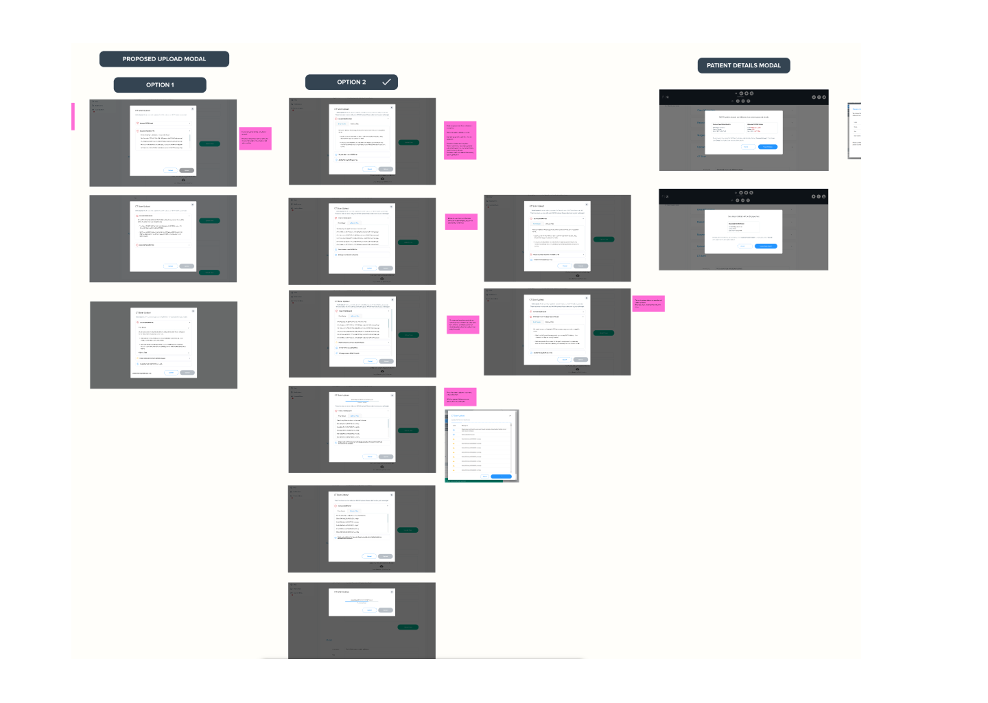
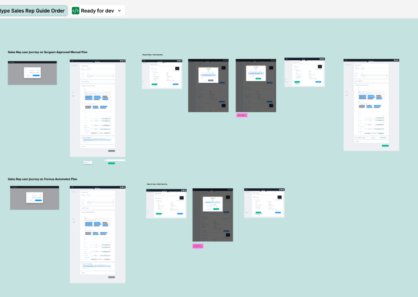
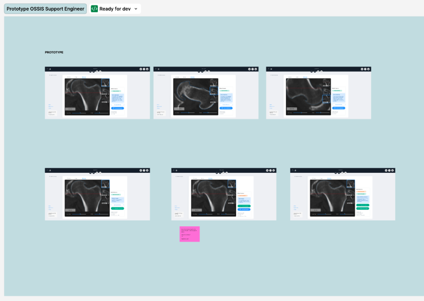
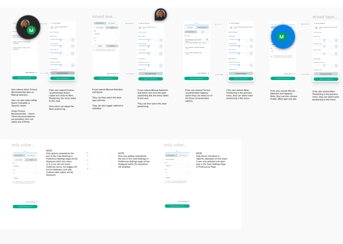
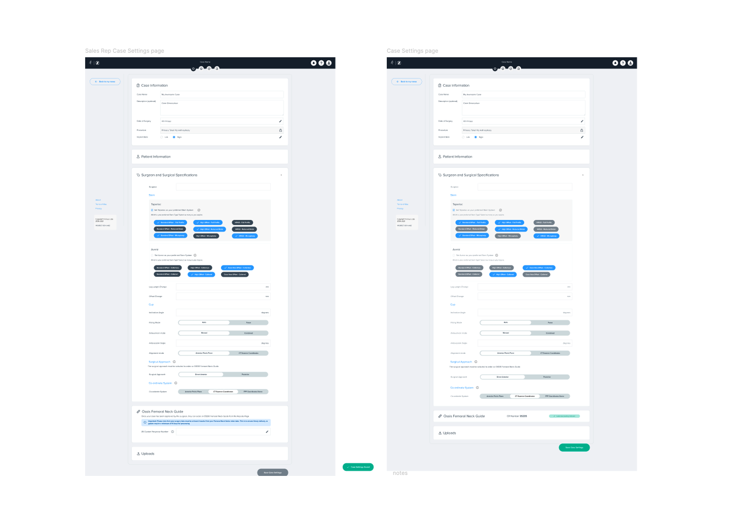
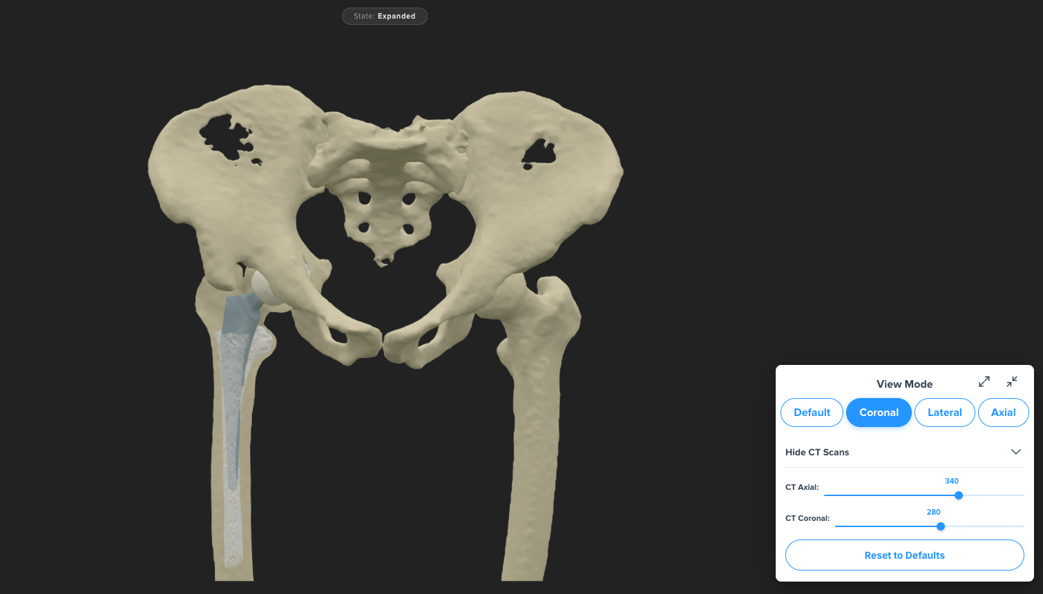
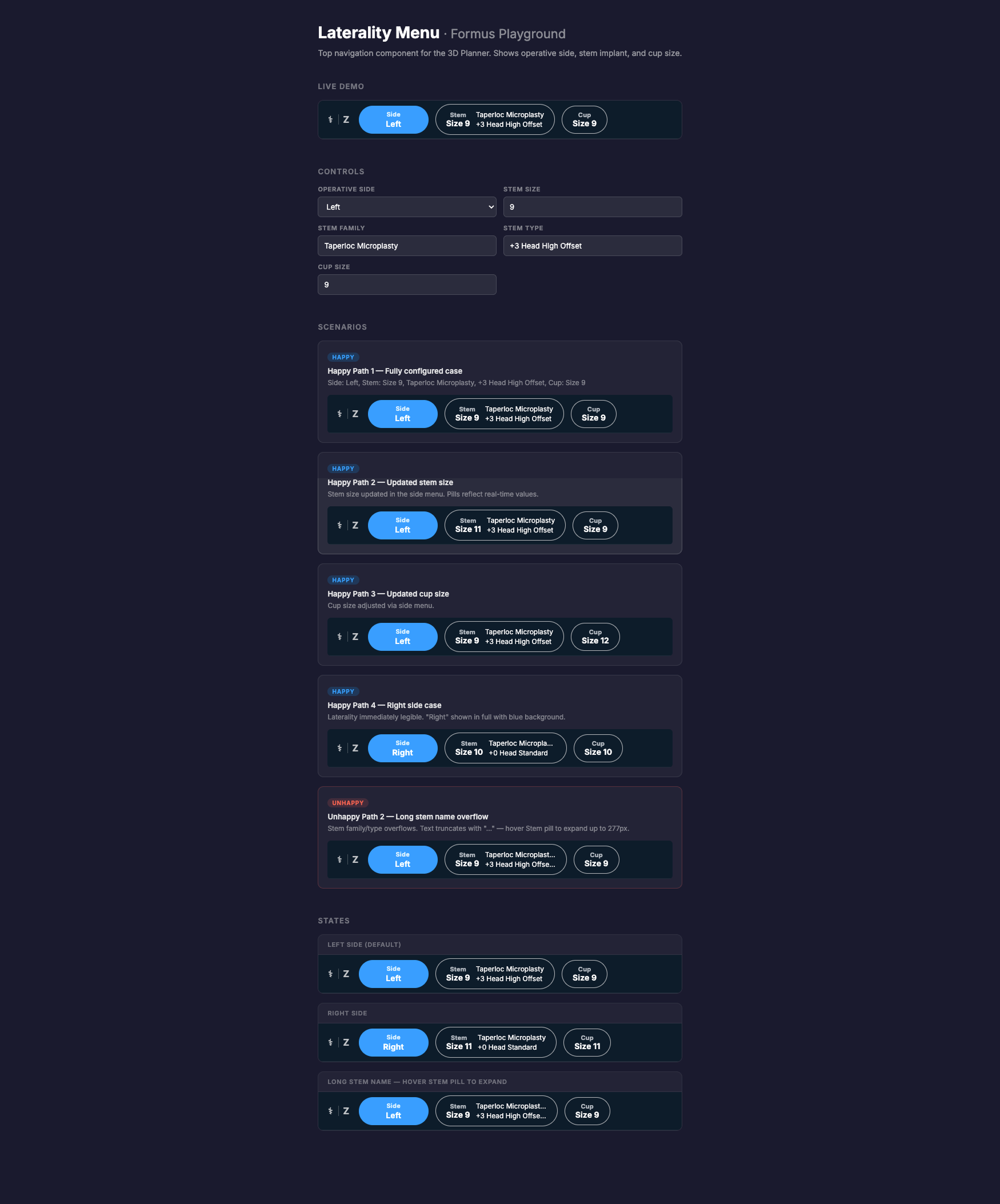
When I joined, the product was clinically strong but inconsistent, hard to navigate, and difficult for new surgeons to trust. I redesigned key areas including the dashboard, imaging workflow, 3D Planner, hip-spine analysis, implant comparison tools, reporting, navigation, and the underlying pattern library ensuring a cohesive design language and focusing on intuitive user flow .
These screenshots show the redesigned interface that resulted from the research, workshops, and iterative UX process outlined below.
the Design Process
After: Validated research loops, shared understanding of user needs, evidence-backed roadmap decision.
I stepped into a product environment where everyone cared deeply about quality, but priorities were filtered through different lenses:
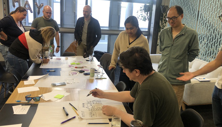
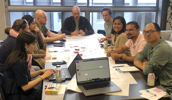
Design Workshoping


Company-wide workshops (props included), to build empathy
• Engineering, Quality, and Leadership aligned on user-first priorities
• Customer insights embedded into roadmap conversations
Fixing the product and user feedback issues was quite a process and it evolved over time. I focused on different areas and different levels of change during my time at Formus.
When I first started I wanted to get the entire team on board with what "Design First thinking" and how it applied to everyones role in the company. To do this I introduced monthly workshops open to the entire company.
For about 18 months, anyone, engineers, sales, quality, leadership, could step into the design tent.
Feedback Strategy


Triaging feedback into verified data
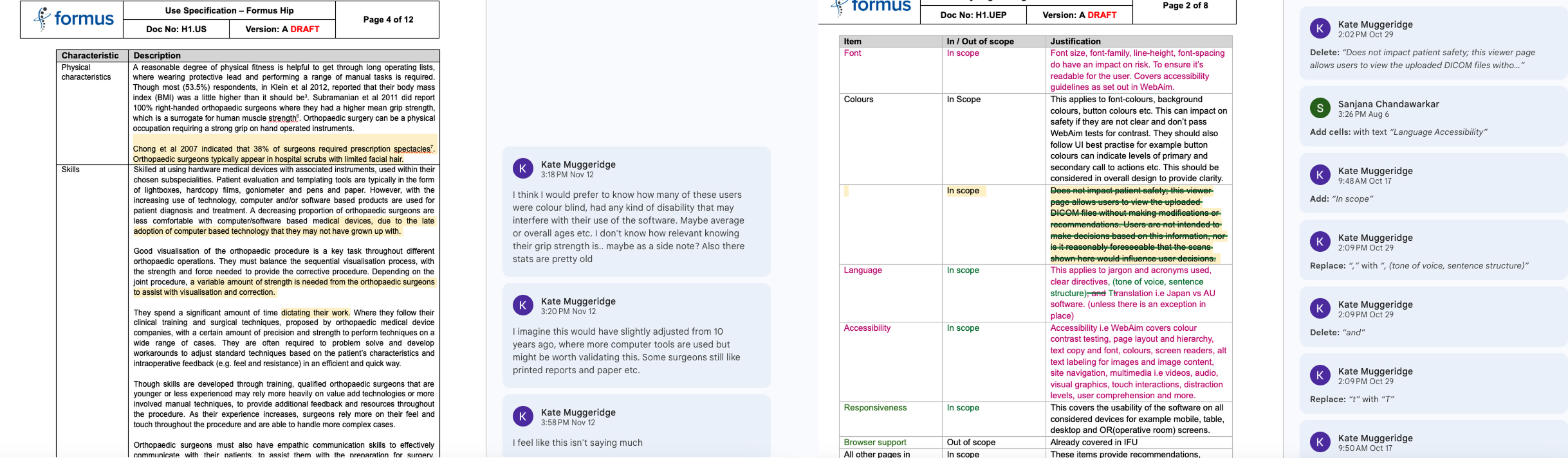
To address the gaps I was seeing between user feedback and actual product improvements, I realised we needed a more structured approach. At the same time, we had a significant CAPA to complete and an outdated Usability Engineering Framework that needed attention. I proposed leading this initiative and combining it with a broader Feedback Strategy.
Feedback Reporting


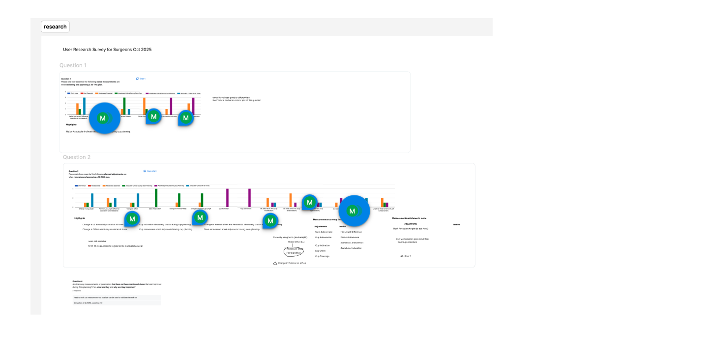
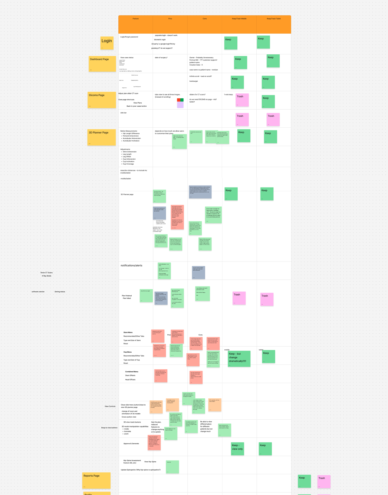
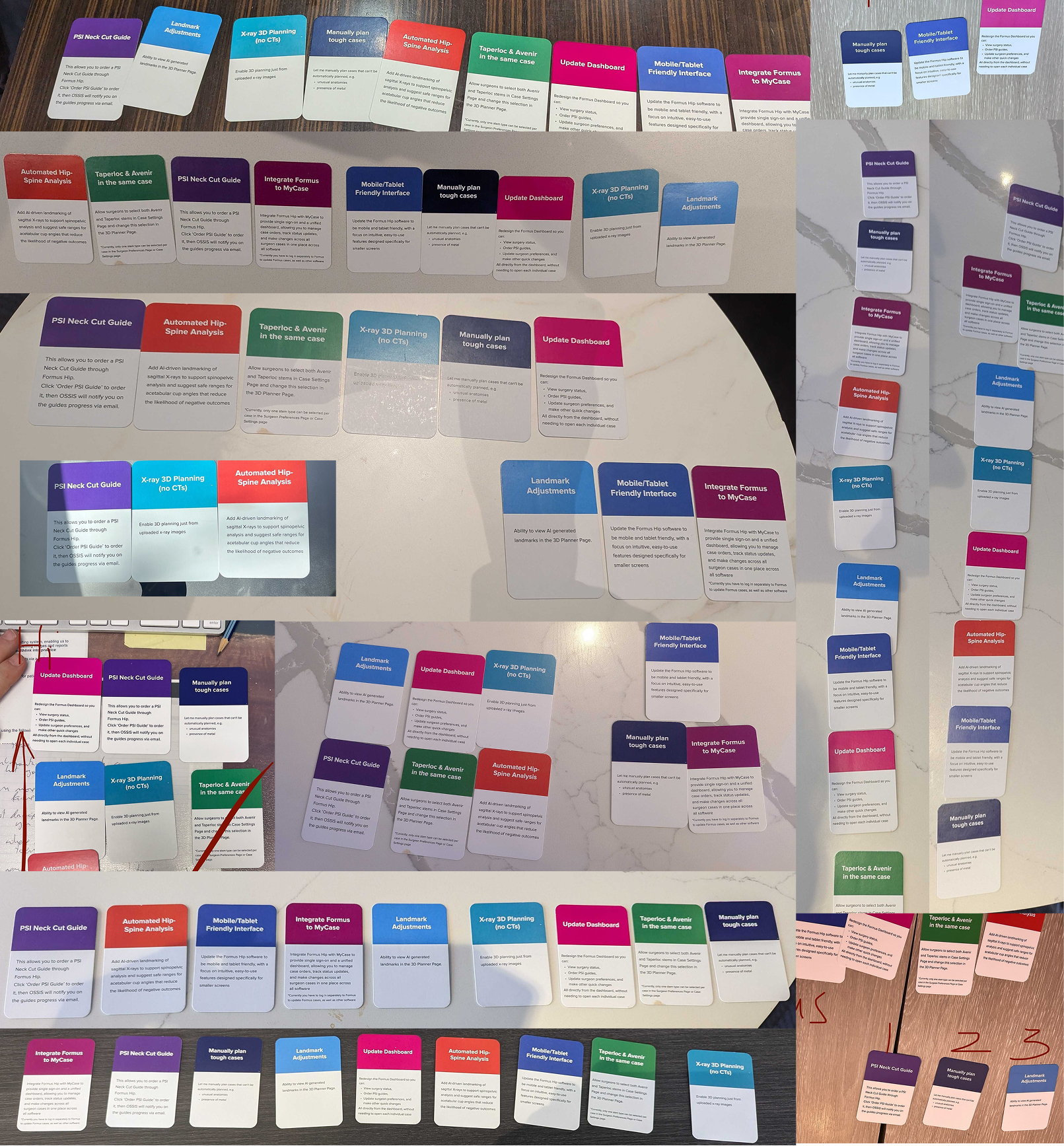
We interviewed surgeons and sales reps at medical conferences. I created a card sorting exercise to rank potential new features from highest priority to least. I then collated the card sorting results into a structured report.
I tallied priorities by group (surgeons vs. sales reps) and combined the data. Direct quotes from the these recorded interviews gave the numbers a human voice.
The most striking insight? Users consistently prioritised transparent, accurate surgical measurements, a feature that had quietly been deprioritised for years. With the card sorting data, we had concrete proof to shift roadmap priorities.
We were generally on track with our roadmap in the short term, however these insights led to a roadmap review with an re-shuffle of priorities, with new ones added. Some highlights from the feedback report are shown
User Research
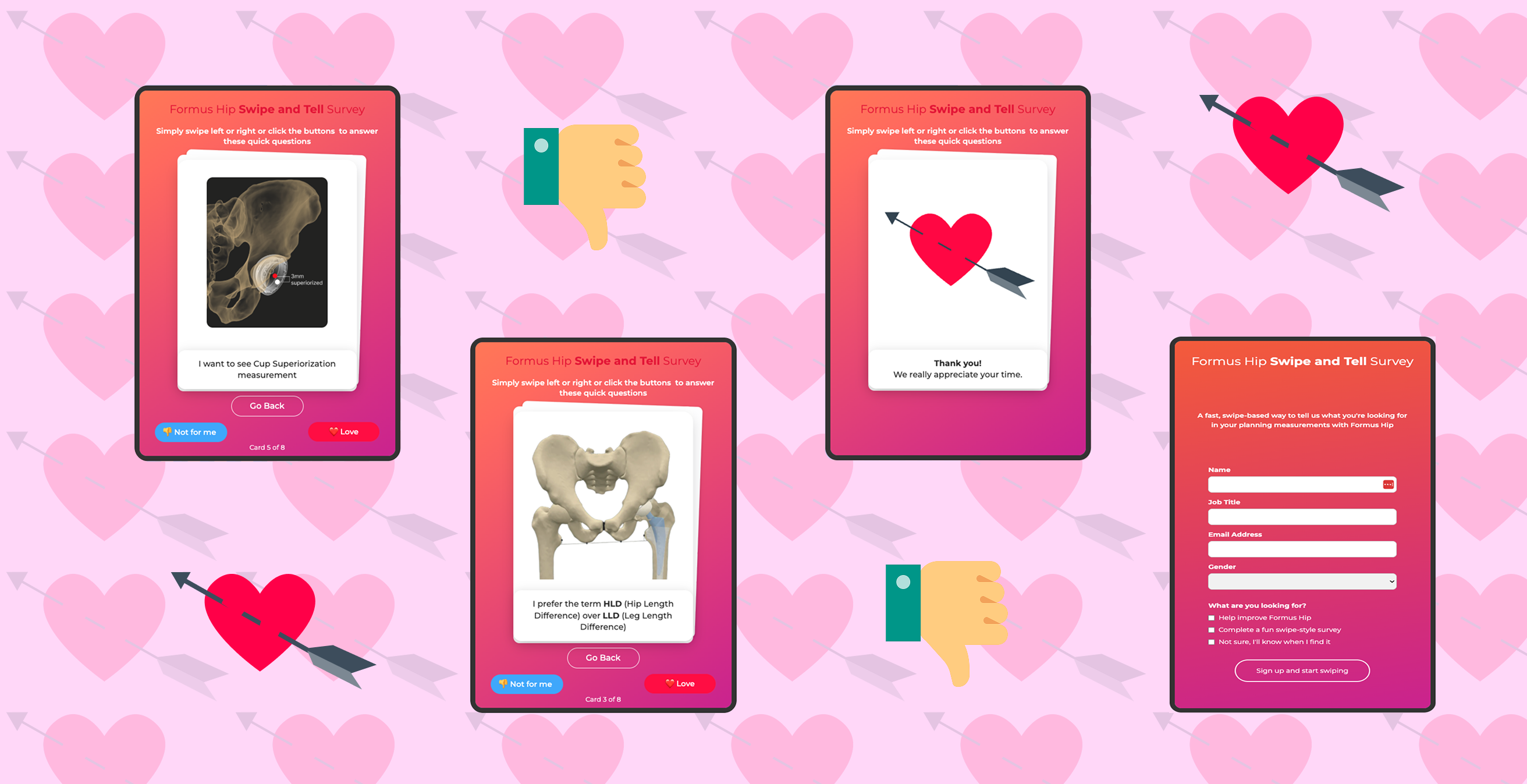
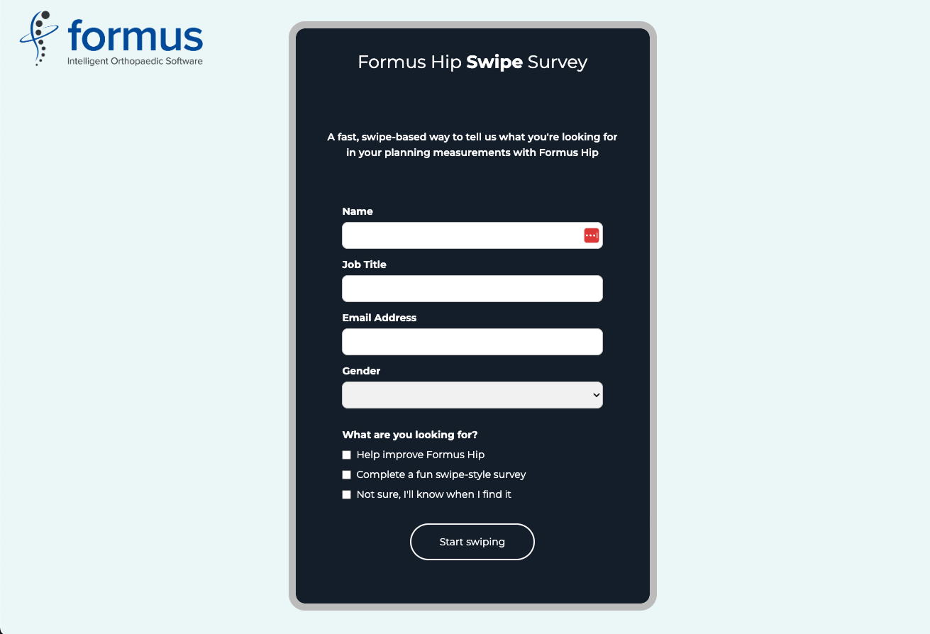
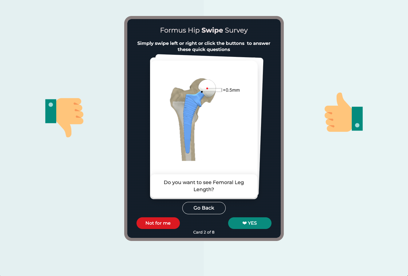
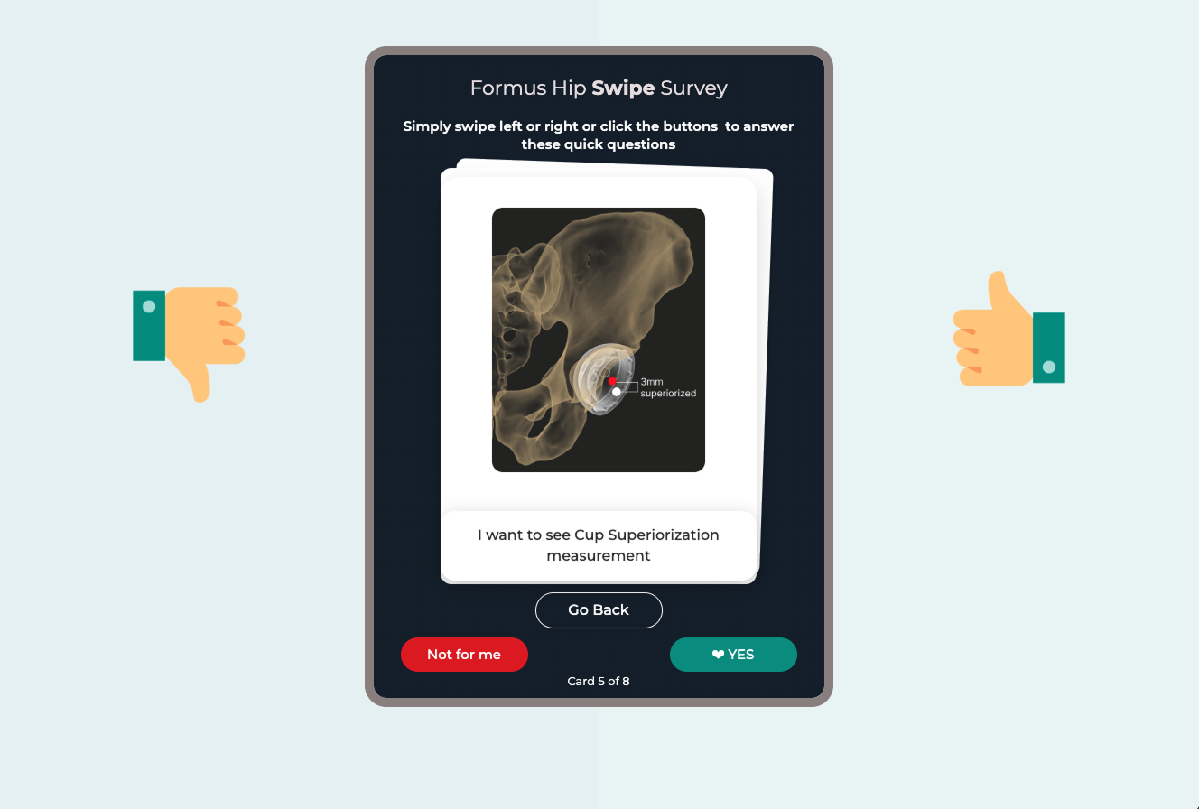
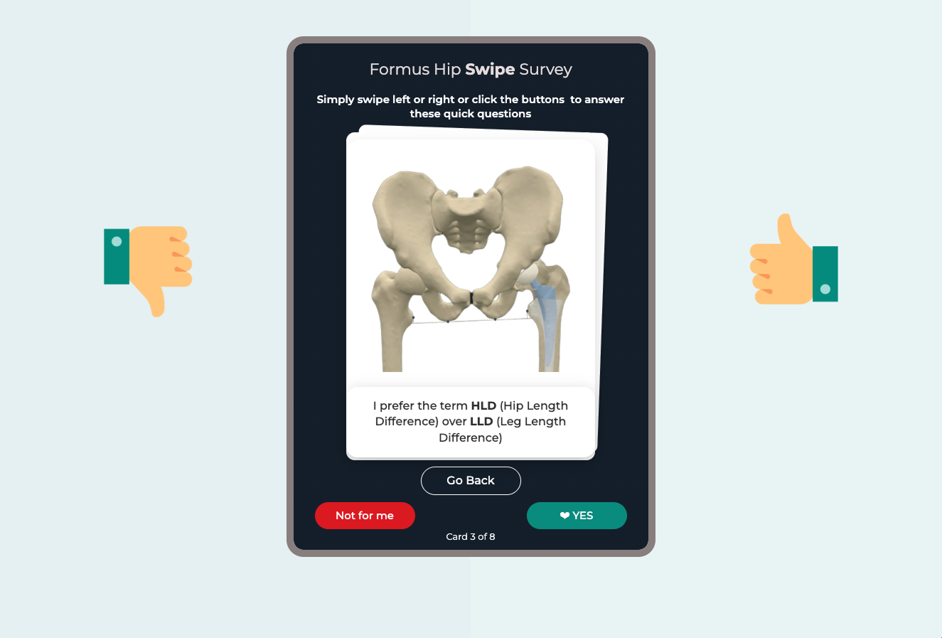
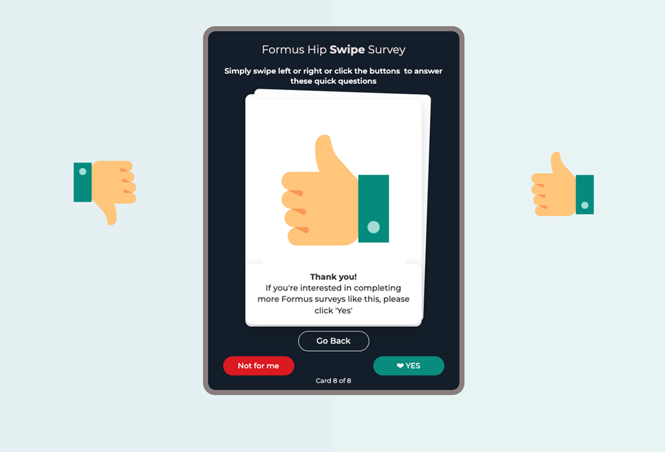
To increase engagement, I designed a Tinder-style swipe survey as a lightweight alternative to our more technical questionnaire, which had only received 4 out of 12 responses. The goal was to quickly validate key data points for key measurements surgeons found most useful. By reframing the experience as quick, visual, and mobile-friendly, I wanted to remove the friction of traditional surveys and appeal to our users who were typically time-poor and bombarded with clinical documentation. It also served as a creative way to test if a more playful format could complement our standard research methods without compromising the seriousness of the subject matter.
I built the experience directly in Webflow as a fast “vibe coding” prototype, which allowed for custom swipe interactions, animations, and a polished, app-like feel. Before sending it wider, I tested it internally with new interns to refine the pacing, clarity, and charm factor. The aim was to improve our responses from Surgeons, it was decided to send this out in the new year.
Design to Code workflow


I introduced an experimental design-to-code workflow using Pencil.dev, Cursor and Figma-to-Claude integrations via VS Code, enabling UI designs to be translated into implementation-ready HTML, CSS and early Vue 3 components that could be pushed directly to the Formus Labs repository. This improved clarity around transitions, micro-interactions and responsive behaviour, helping reduce traditional handover time and allowing engineers to reuse front-end foundations.
AI-generated outputs were typically 90–95% production ready, accelerating early development, although some refinement still required direct code adjustments when rendering was imperfect. Overall, the approach helped shorten engineering delivery cycles and reduce interpretation overhead, while shifting a small amount of additional refinement effort into the design phase.
Outcomes - so far
From Siloed Voices to Shared Understanding
Instead of design and CX advocating alone, now everyone from engineering to quality is using customer-first language in roadmap conversations.
Workshop impact: 18+ workshops run over 1.5 years created hands-on empathy across the company.
Card sorting proof: Transparent measurements went from a long-standing CX concern to a top roadmap priority.
Shared excitement: Quality embraced accessibility standards, engineering integrated user insights into planning, and the CEO proclaimed the company to be product-led.
Knowledge sharing: With Dovetail, user interviews became living documents, not forgotten anecdotes.
AI tools and Design to Code estimated to cut down 20-30% of engineering development time as well as handover and product design code review.
We’re not finished, but we’ve shifted from reactive firefighting to proactive understanding.
reflections
Culture Shift
What I Learned While Building the Framework
Frameworks only stick if they make people’s jobs easier.
If a framework feels complicated or theoretical, it ends up forgotten in a spreadsheet. Our old Usability Engineering Plan fell into this category. By shifting it toward clear, evidence-based principles that aligned with our design system, it became something the team could actually use day to day rather than something reserved for audits.
Participation beats persuasion.
The most effective way to create buy-in was getting people involved. I asked engineers, researchers, and quality leads to walk through real scenarios such as a surgeon preparing for surgery or a sales rep using the software during a call. Experiencing the friction directly had far more impact than any explanation.
Usability directly affects patient outcomes in regulated industries.
Working through the CAPA highlighted how closely usability and clinical risk are connected. Issues like colour contrast, terminology, or readability can influence surgical decisions. It is part of delivering safe and accurate planning tools.
Feedback only works when it is visible.
Previously, customer feedback often disappeared into Jira without meaningful action. By creating regular cross-functional discussions, everyone could see recurring themes across support calls, conferences, and surveys. Once the feedback was visible and connected, priorities shifted. The organisation began to treat user experience as essential to customer satisfaction and product quality, not as a lower priority behind technical tasks.
.gif)
.png)