myhub
UX/UI Designer
Front End Web Development
4.5 years
B2B | SaaS Software and website builder
End-to-end product design, front-end implementation, iteration over multiple product phases
Key Impact
70
Expanded market share by growing from CMS software to a website builder, enabling 70+ new customer-built websites
23
Redesigned core product that supported ~114 customer accounts annually and supported onboarding of +23 new organisations
24
Designed 24 new template pages for CMS. Redesigned 9 new software features
Over 4.5 years, I became deeply embedded in the product, owning both design and front-end execution and acting as a key bridge between product, engineering, and delivery.
MyHub began as a simple intranet builder. When I joined, it was growing fast but struggling to scale: fragmented UI, inconsistent modules, customers using workarounds, and a product roadmap shaped more by bug fixes than user needs.
Over 4.5 years, I redesigned and built the core CMS in Webflow, then continued to design new features, modernise flagship modules, and establish UX and research practices that helped move the company from bugs-led priorities to a more user-focused approach.
The redesign didn’t just improve usability, it expanded the company’s strategic direction.
My work helped MyHub transition from “just an intranet” into a flexible public-facing website builder, enabling it to compete with Canva, HubSpot, and Wix, while still retaining a loyal, low-churn customer base.
Customisation
The redesign made MyHub customisable in a way that felt simple even for users unfamiliar with website tools.
Administrators could adjust layouts, styles, and modules through clear, intuitive controls, allowing them to create pages and manage workflows quickly without technical skills.
User Engagement
The overall experience became much easier to use through conversational, user-centred language and more intuitive UI patterns. I introduced light gamification elements to make common tasks feel more engaging and to guide users without adding complexity.
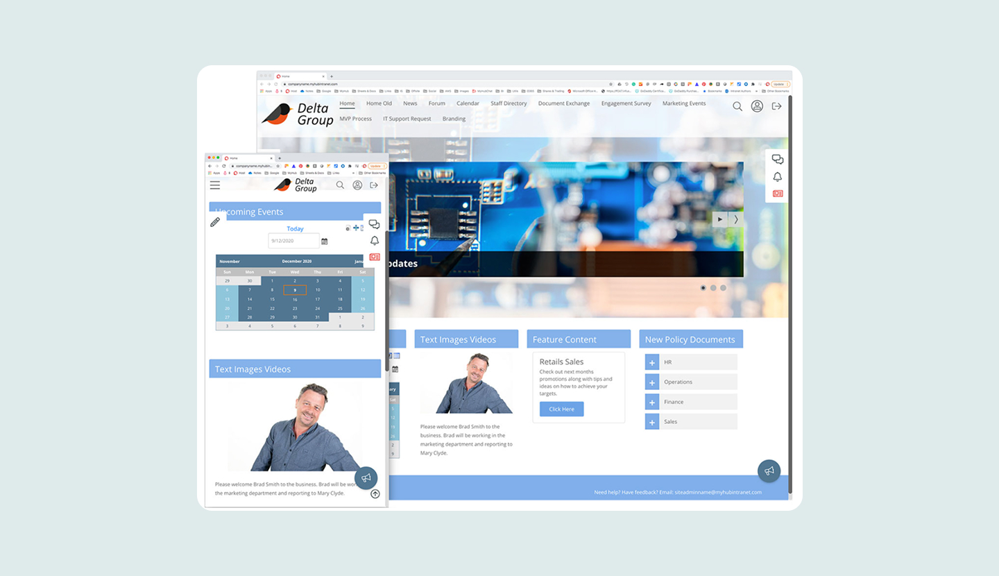
Making the entire platform responsive also transformed how people used MyHub, allowing them to complete tasks smoothly across desktop, tablet, and mobile.
Product Expansion
The redesign helped MyHub evolve from an intranet-only tool into a more modern website builder and CMS.
I introduced clearer onboarding and contextual guidance, created consistent UI patterns across the platform, and added new page templates that made it easier for users to build polished sites quickly. These updates expanded the product’s capabilities while keeping the experience simple for non-technical users.
User Research
Uncovering User Pain Points
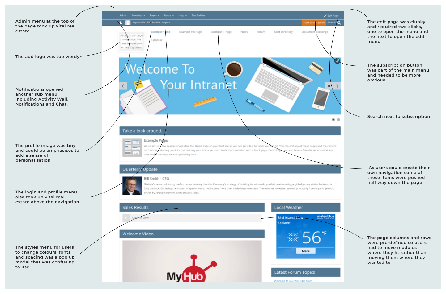
When I began interviewing customers, I discovered that many of them were quietly coping with issues. They were encountering bugs that they assumed were normal, and they were adapting their workflows to fit the tool rather than the tool supporting their workflows. The Staff Directory, for example, required employees to be logged into the system, which made the module less useful for businesses that needed a more accessible contact list. What MyHub assumed was a feature, was actually a frustration.
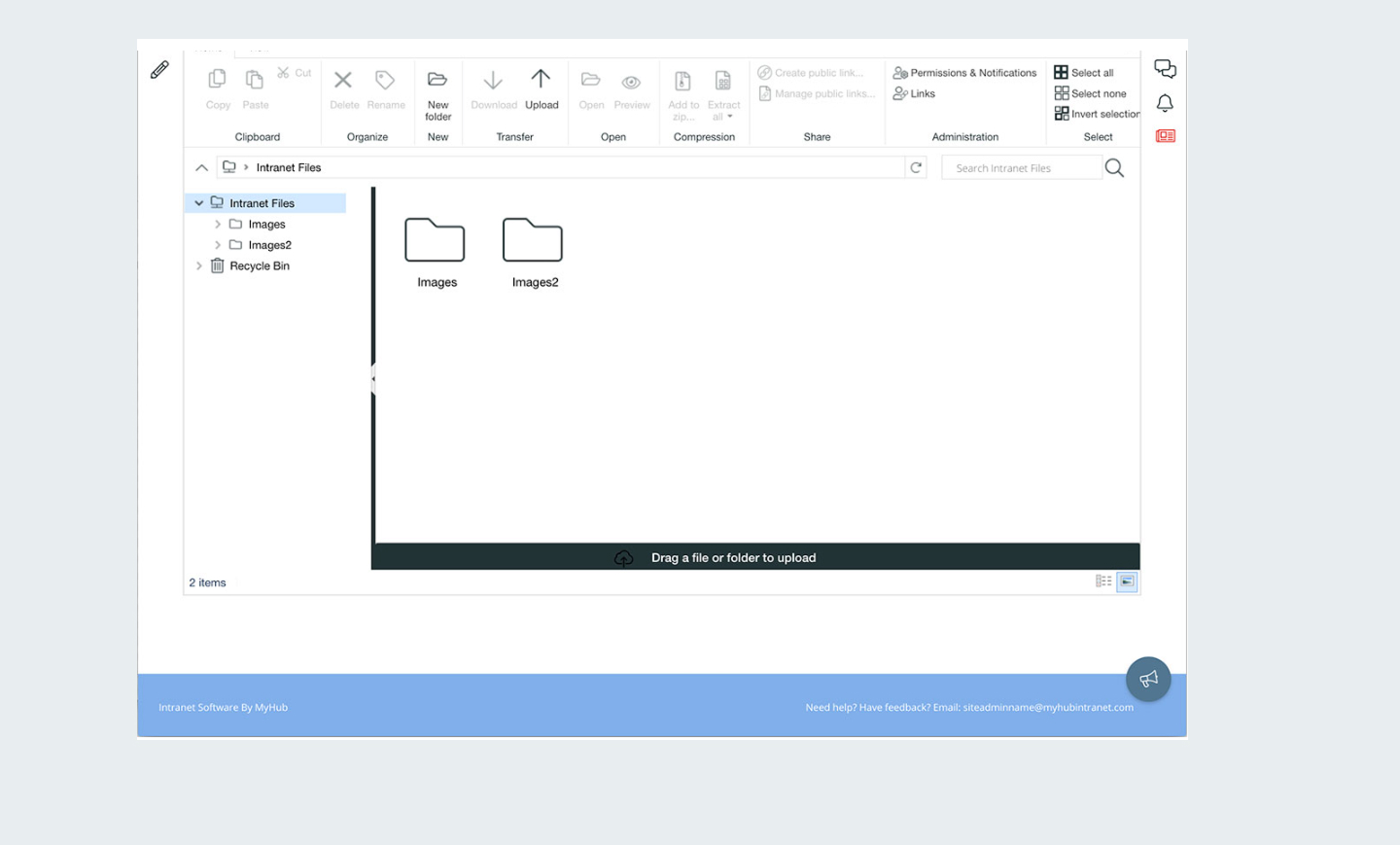
The Files module made storing documents possible but not intuitive. Some of the most used modules had been built quickly with off-the-shelf solutions in the early days of the product, and their structure no longer aligned with how businesses wanted to use them.
There was also very little true understanding inside the company of what users needed or how they worked. Product decisions were often influenced by engineering constraints or the most recent set of support tickets. The business wanted to be product-led, but the internal processes and knowledge did not yet support that.
One of the key things I discovered was how important it was to have user feedback via regular user interviews, emailed and in software surveys and NPS ratings. This really helped transform the software and meet users where they were. It also highlighted the dangers for any business to assume a use case without user testing.
.jpg)
Design Approach
My Role and Design Approach
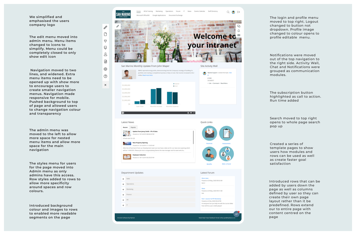
My role combined product design, UX strategy, and hands-on front-end development. I handled early research, user interviews, information architecture, wire-framing, prototyping, high-fidelity visual design, and implementation of the new UI. I rebuilt much of the interface using HTML, Sass, and JavaScript, and introduced more scalable patterns that made ongoing development faster and more predictable.
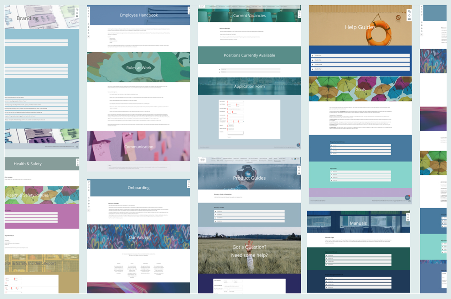
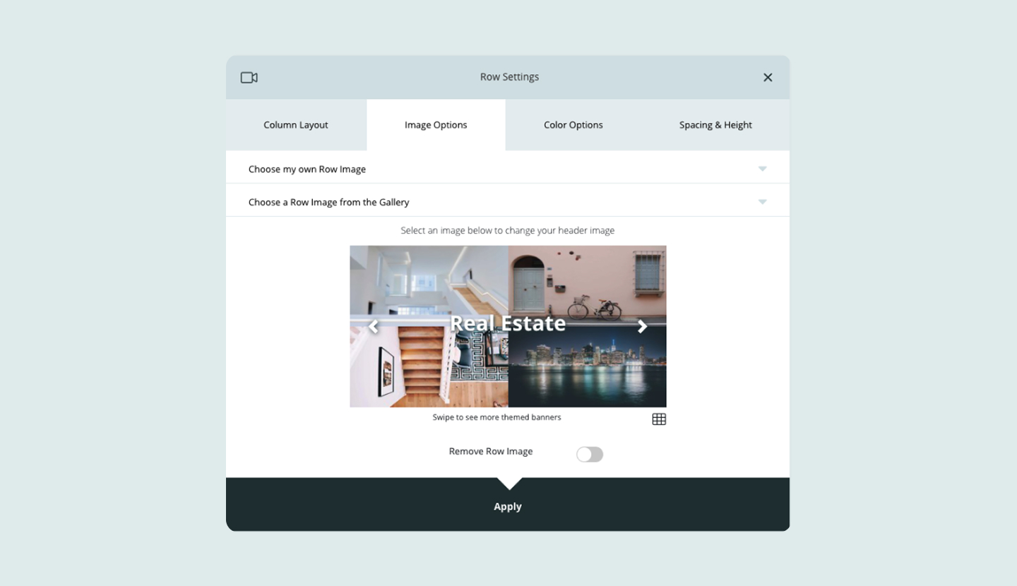
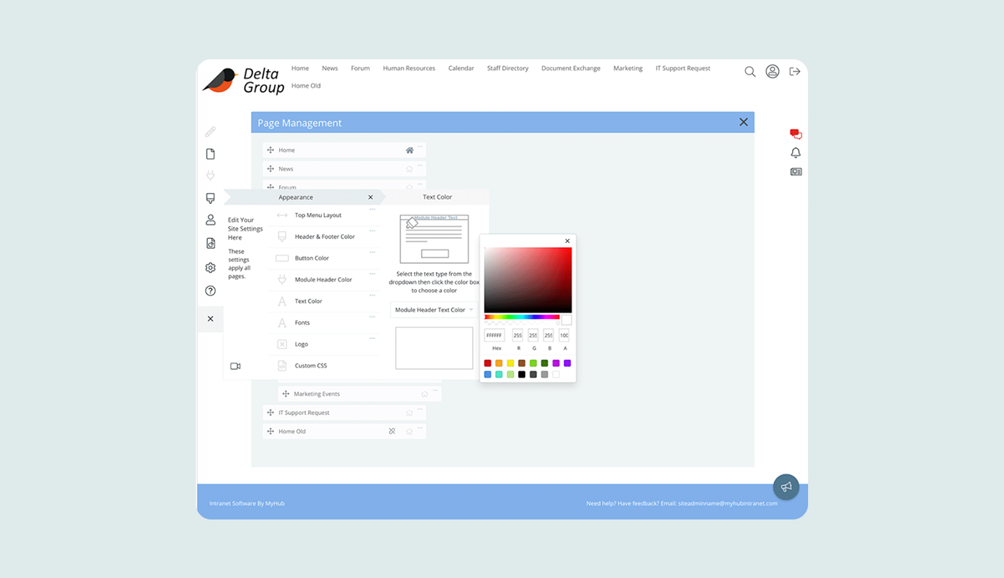
A key part of my approach was establishing consistency across the product. I created a unified visual system that clarified typography, colours, spacing, buttons, cards, and layout rules. This brought structure to the product and helped reduce cognitive load for users who previously had to adapt to every module behaving differently. I also designed a flexible row and column layout system that allowed customers to create pages with more freedom without risking broken layouts.
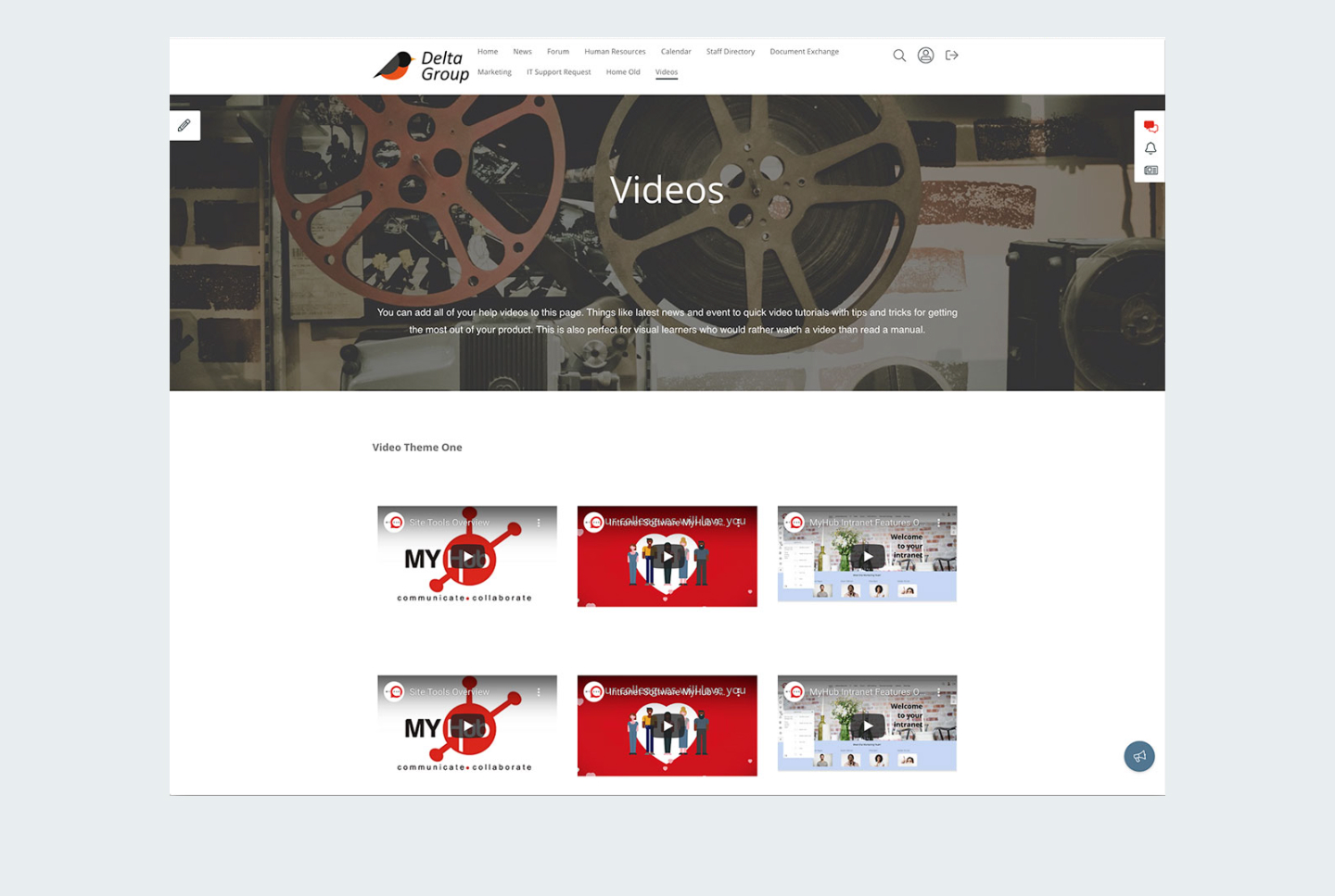
I then created a range of the most commonly used template pages, so users could easily get their intranet or website up and running faster.
Alongside the interface work, I collaborated closely with engineering, support, and sales teams. I shared research insights and worked to introduce user-centred practices that supported company-wide decision-making. Over time, the team became more comfortable with usability discussions, prototyping sessions, and user-driven prioritisation. It became easier to align the team on customer needs and reduce the guesswork that had previously shaped the roadmap.
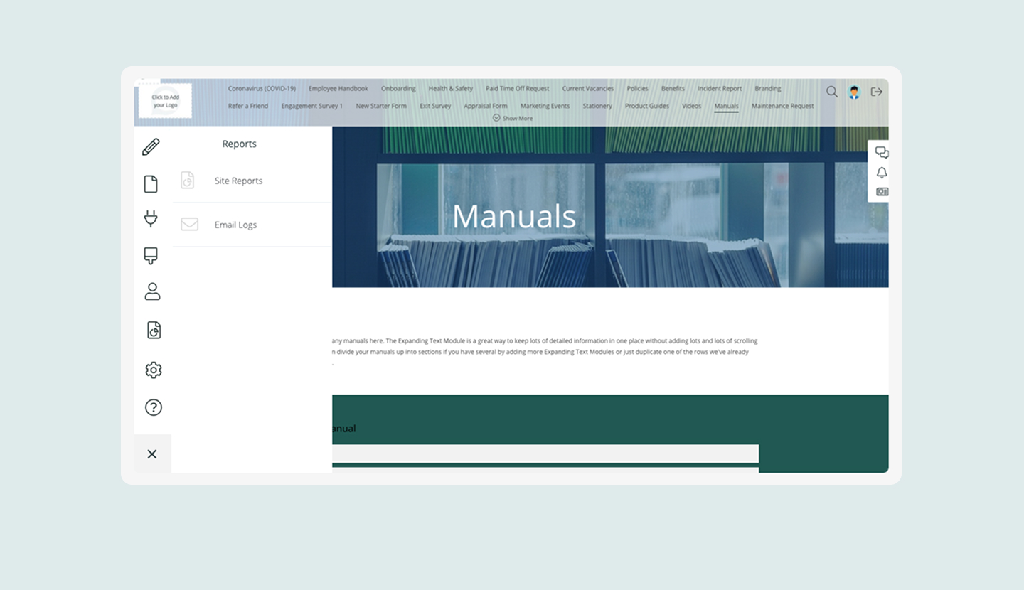
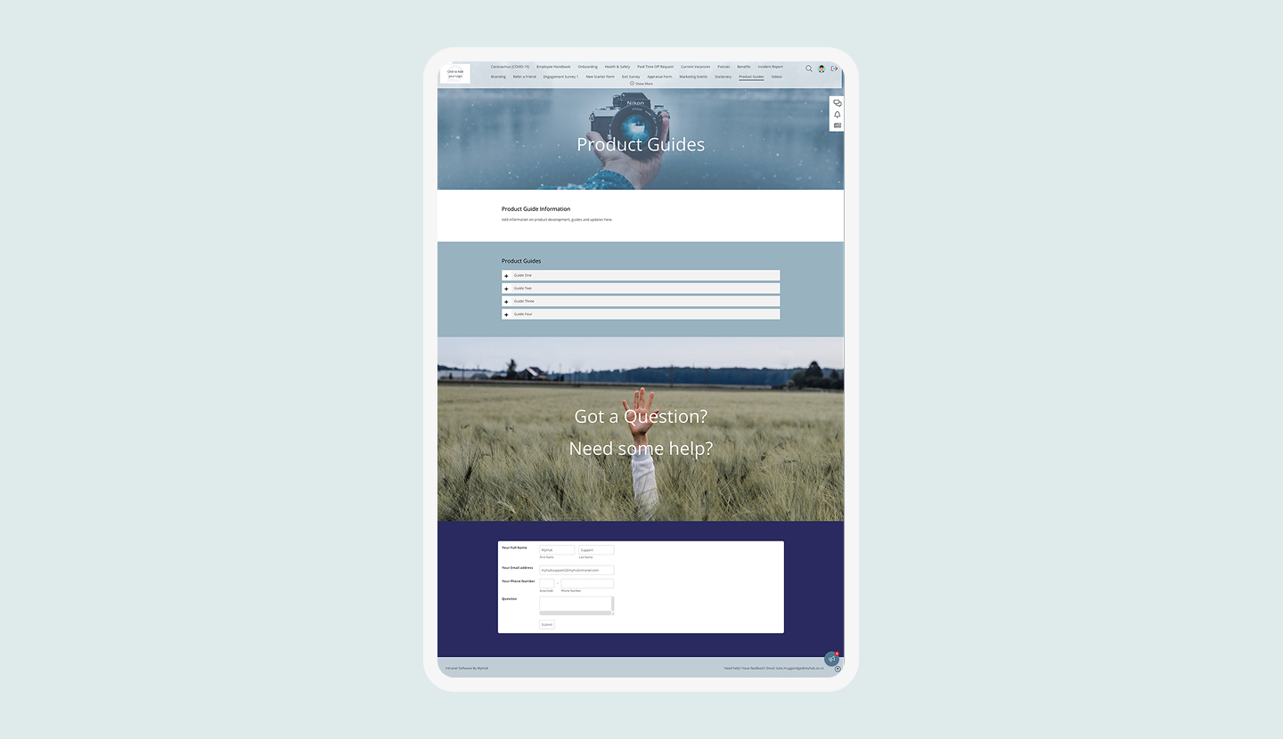
Module Re-Design
Redesigning Key Modules
The redesign touched nearly every major part of the product.
I redesigned the Files module to improve folder structures and make file uploads and browsing more intuitive. The old Forum module was completely reworked into a modern Discussion Board with clearer navigation and a less cluttered interface. The Page Builder was rebuilt to make the editing experience easier to understand. Users no longer had to guess whether they were in editing or preview mode. The dashboard and homepage modules were redesigned to help administrators create more meaningful landing experiences for their staff.
I also created a new responsive design system across the platform. Many users were accessing MyHub on mobile devices, especially during the period when remote work increased rapidly during COVID. The mobile experience before this redesign was difficult to use. The new responsive layouts and navigation greatly improved accessibility and contributed to customer retention during a time when many competing intranet products were struggling.
Strategic Opportunities
Opening New Strategic Opportunities
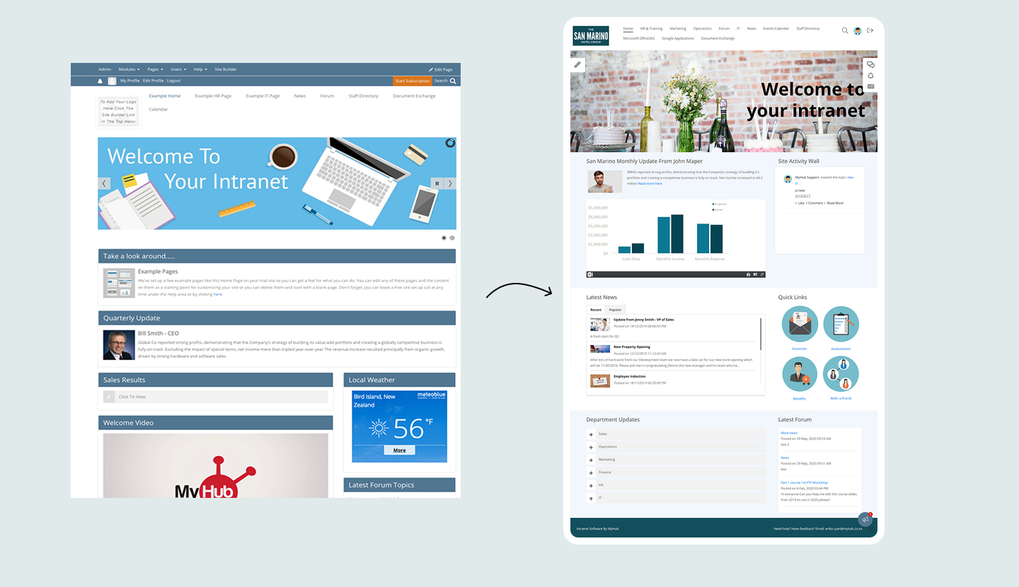
A key outcome of the redesign was a shift toward a modern CMS that could support both intranets and public-facing websites. I updated the visual design, layout system, and page templates to feel more like a contemporary website builder rather than a traditional intranet from the 90s.
This opened the door for customers to use MyHub for marketing sites, community pages, and simple public websites. It was a strategic design choice and it expanded the product into a category previously dominated by larger players.
While MyHub was not competing directly with the biggest platforms, its clarity, simplicity, and ease of use resonated strongly with customers and helped maintain low churn and high loyalty.
Impact and Outcomes
Impact on the Business
Improved usability and consistency across core workflows through iterative design and front-end refinement
Enabled faster iteration by owning both design and implementation
Supported long-term product evolution across multiple phases and business priorities
Customer interviews showed clearer satisfaction with the new interface. Support teams reported fewer questions about editing workflows. The product became easier to onboard, easier to navigate, and easier for non-technical administrators to manage. The improvements to responsiveness made the platform more accessible worldwide, which helped sustain growth during the years when many competitors were struggling or closing especially over covid.
Internally, the redesign helped the company shift toward more user-centred practices. The new design system reduced front-end inconsistencies and helped developers move faster with fewer regressions.
My work strengthened the product’s long-term stability while opening doors to new business opportunities. It improved the user experience, supported company growth, and positioned the platform for a broader market than originally imagined.
Reflections
Reflections
MyHub was where I learned what it actually takes to move a legacy product forward without breaking what customers already depended on. The work required holding two things at once: understanding the existing system well enough to redesign it responsibly, while pushing hard enough to make the changes matter.
The most useful skill I built here wasn't technical. It was learning how to translate user research into decisions that engineering, sales, and support could all get behind. Getting alignment across those teams, on a small budget, in a product that had grown organically for years, was the real design challenge.
The 404 pages were a reminder that craft doesn't have to stop at functional screens. MyHub wanted error pages so I built a desert scene, a lost-in-space page, and a locked-out-of-your-spaceship login error, all built in Sketch and animated in Webflow. Small details, but the kind that customers noticed.


.gif)
.png)