Carbonclick
Senior Product Designer
Verified Impact
• Turned agency re-brand into a production-ready, CMS-driven ecosystem, with dashboards that lifted consumer offset uptake from 40% to 88%.
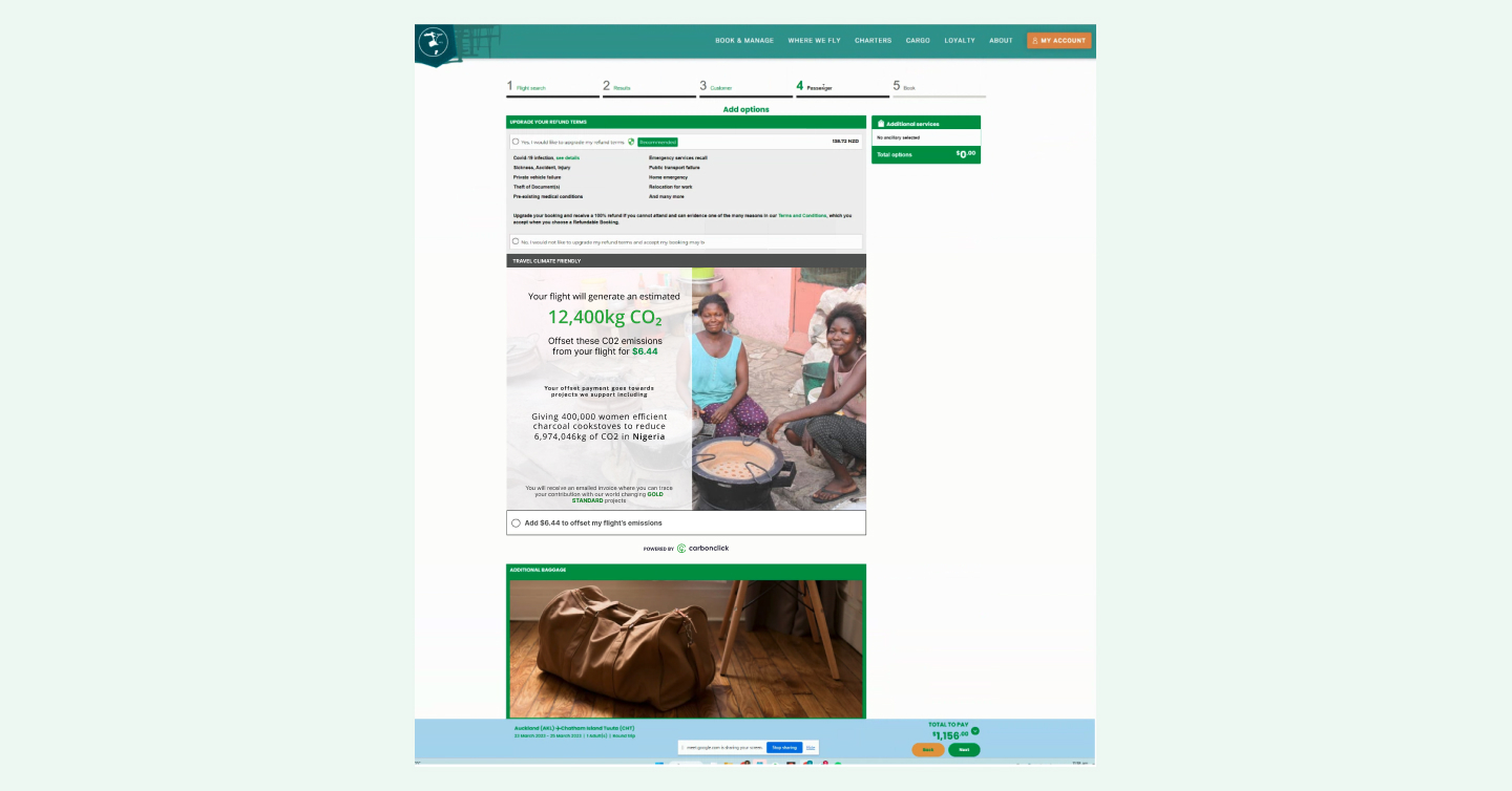
• Designed white-label widgets and website pages, that let stores sell Sustainable Aviation Fuel certificates and forest credits to their customers in one click
Strategic Contribution
• Presented data-backed pricing restructure to C-suite; proposal approved for 2024 roadmap before engagement ended.
Role
Led end-to-end product design, stakeholder alignment, and engineering hand-off for a production-ready carbon-offset storefront and CMS
5 months
B2B2C | SaaS Platform
CarbonClick lost Series A funding during my engagement. Rather than treating that as a hard stop, I put together a recovery strategy for the founders, grounded in the product gaps and investor metrics they still needed to hit. This case study covers both the design work I delivered and the strategic recommendations I presented before the engagement ended.
The challenge
Making Carbon Offsetting mMeaningful
While climate consciousness was growing globally, our data showed that only 8% of users who expressed environmental concern actually completed carbon offset purchases.

The existing platform suffered from:

• Cognitive overload: Users couldn't understand carbon measurement units.
• Trust barriers: No transparency in offset project verification.
• Complexity paralysis: 73% drop-off during multi-step offset process.
• Business impact: Low B2B customer retention due to poor dashboard experience.
Stategic approach & stakeholder alignment
Cross -Functional Leadership
• Facilitated workshops across six stakeholder groups: sustainability experts, engineers, sales, and the executive team.
• Defined product strategy balancing immediate user needs with investor-facing business goals.
• Established a design system to support consistent, scalable B2B2C experiences.
market Research insights
• Conducted competitor analysis across five carbon offset platforms.
• Identified real-time impact visualisation as the key product differentiator.
• Mapped gaps between what CarbonClick was building and what target customers actually needed.
technical constrains navigation
• Navigated payment provider integration across multiple markets.
• Worked within real-time carbon credit pricing from multiple exchanges.
• Prioritised mobile-first design for accessibility compliance.
Consolidating Data
CarbonClick had made three years of product decisions without structured user research. I introduced it from scratch, starting with Sales and Marketing interviews to consolidate existing customer knowledge, then moving to direct interviews with both current customers and non-adopters in the target market.
This gave us validated signal on real friction points, pricing expectations, and messaging gaps, replacing assumptions with evidence before any further design work began.
Pricing and value
CarbonClick's subscription model had a known retention problem: plans weren't delivering enough ongoing value to keep customers engaged past the first few months.
My proposal restructured pricing entirely. Rather than $99 or $399 per month, SMEs would pay $99 per year as a low-barrier entry point, then purchase impact bundles as needed, giving customers flexibility while improving the metrics investors were watching.
Product Teams
Marketing Teams
Working alongside the marketing team, I identified that the existing landing pages led with CarbonClick's values rather than customer outcomes.
We redefined the value proposition to speak directly to what SMEs were actually buying: credibility with their own customers, not just carbon credits. This fed into a revised funnel strategy ahead of the founder presentation.
User interviews
Validate, Validate, Validate
When I joined CarbonClick, there had been no structured user research in the company’s first three years. Product decisions were largely informed by ad hoc sales feedback and externally commissioned research focused on the marketing website. While useful, these inputs were inconsistent, unvalidated, and limited to existing customers, leaving a major gap in understanding non-customers and unmet needs.
I introduced a formal user-research approach, starting with internal interviews across Sales and Marketing to consolidate existing knowledge and align insights with the product roadmap. I then proposed and led a customer-validation strategy, interviewing both current customers and businesses in our target market who had not yet adopted CarbonClick.
This work focused on validating real problems, understanding carbon-offsetting awareness, and testing expectations around features, pricing, and messaging. By grounding product direction in validated user needs rather than assumptions, this research established a stronger foundation for engagement, growth, and investor confidence.
Personas vs Thinking Styles
Standard personas tend to segment by demographics, which tells you who someone is but not how they make decisions. I developed Thinking Styles alongside our personas to map cognitive and emotional patterns instead, capturing how customers approach sustainability commitments, what builds trust, and where they disengage.
This gave the product team a more useful frame for prioritising features and messaging.
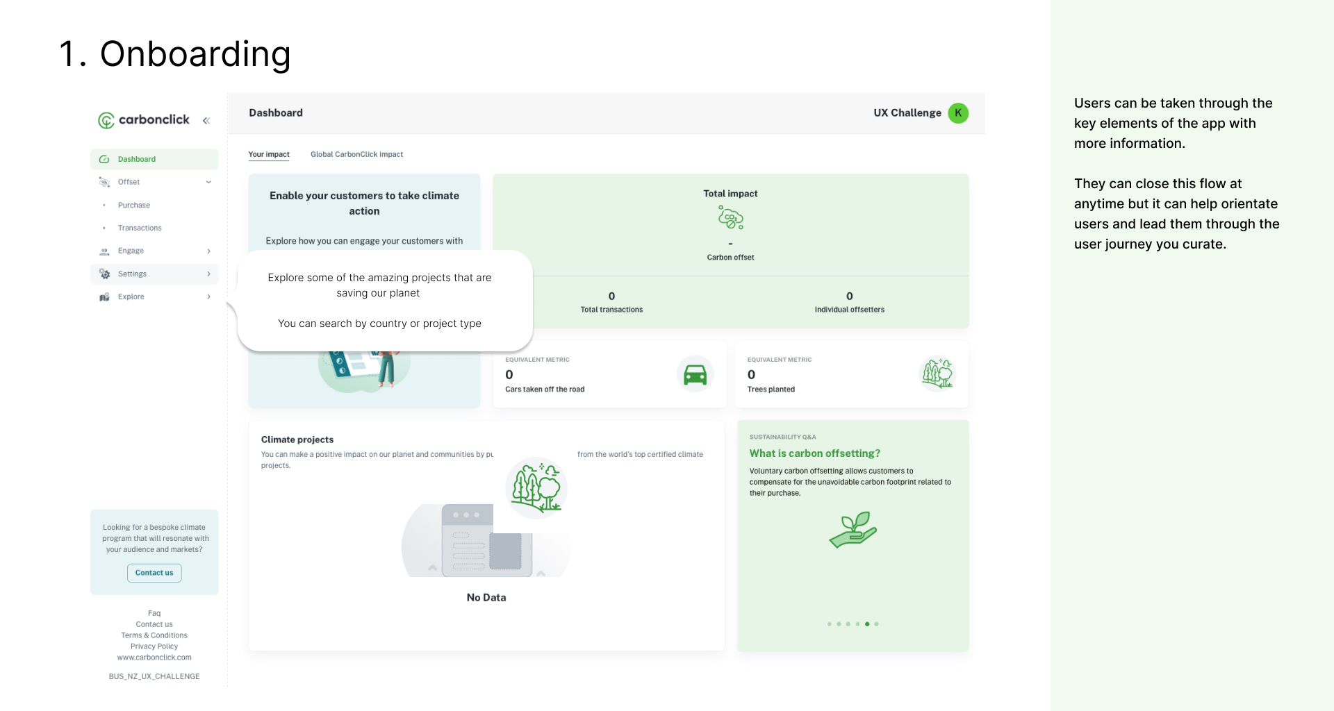
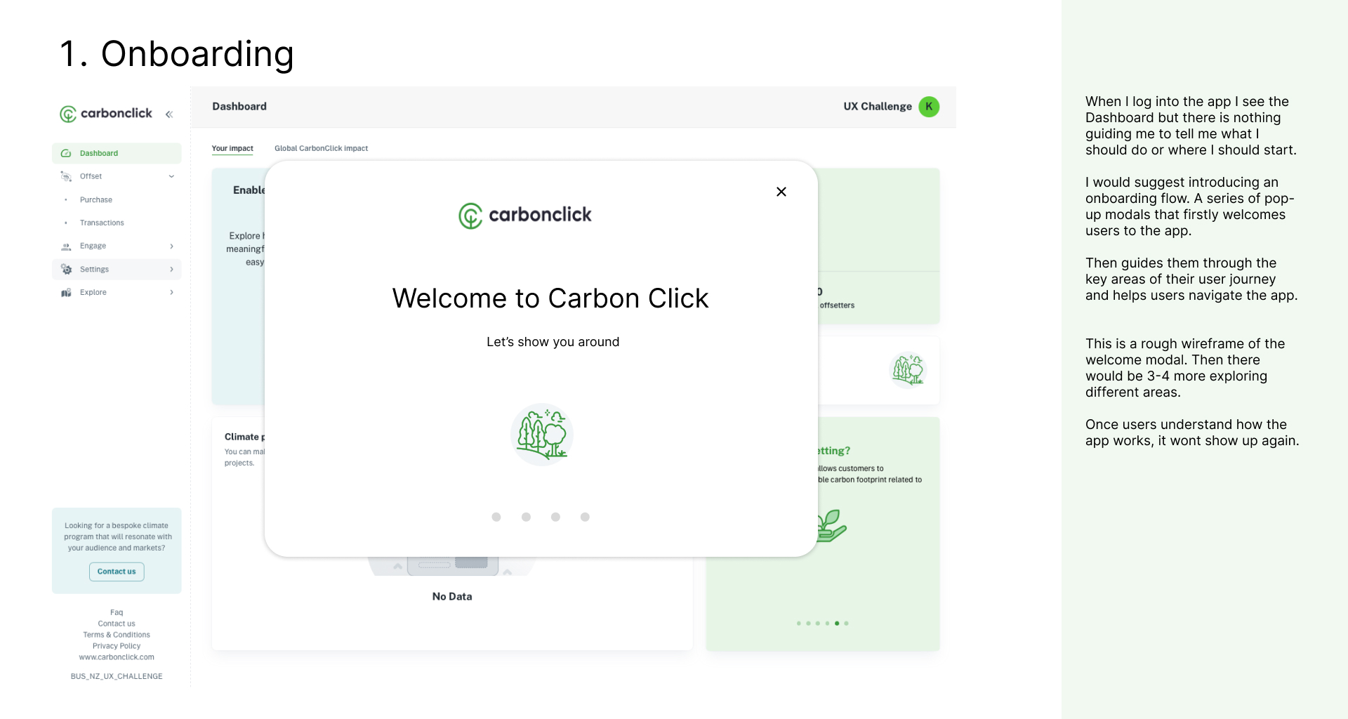
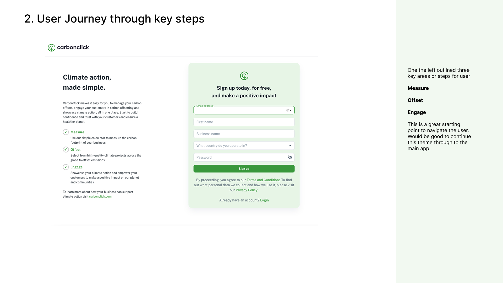
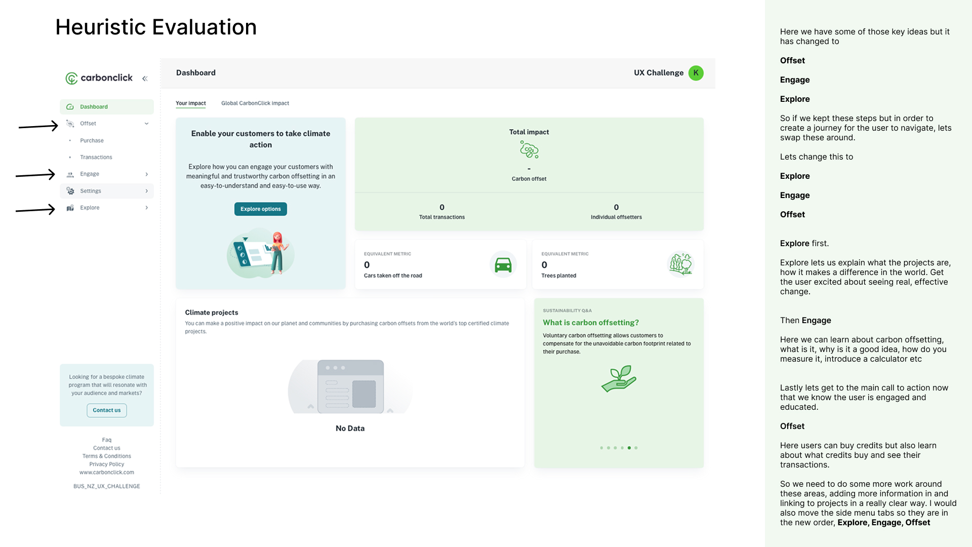
Examining Carbon Click's App
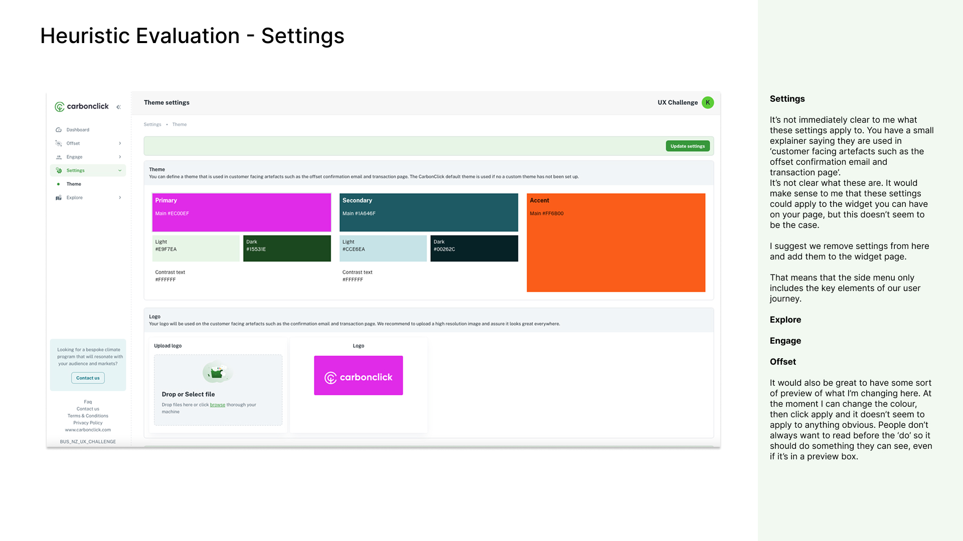
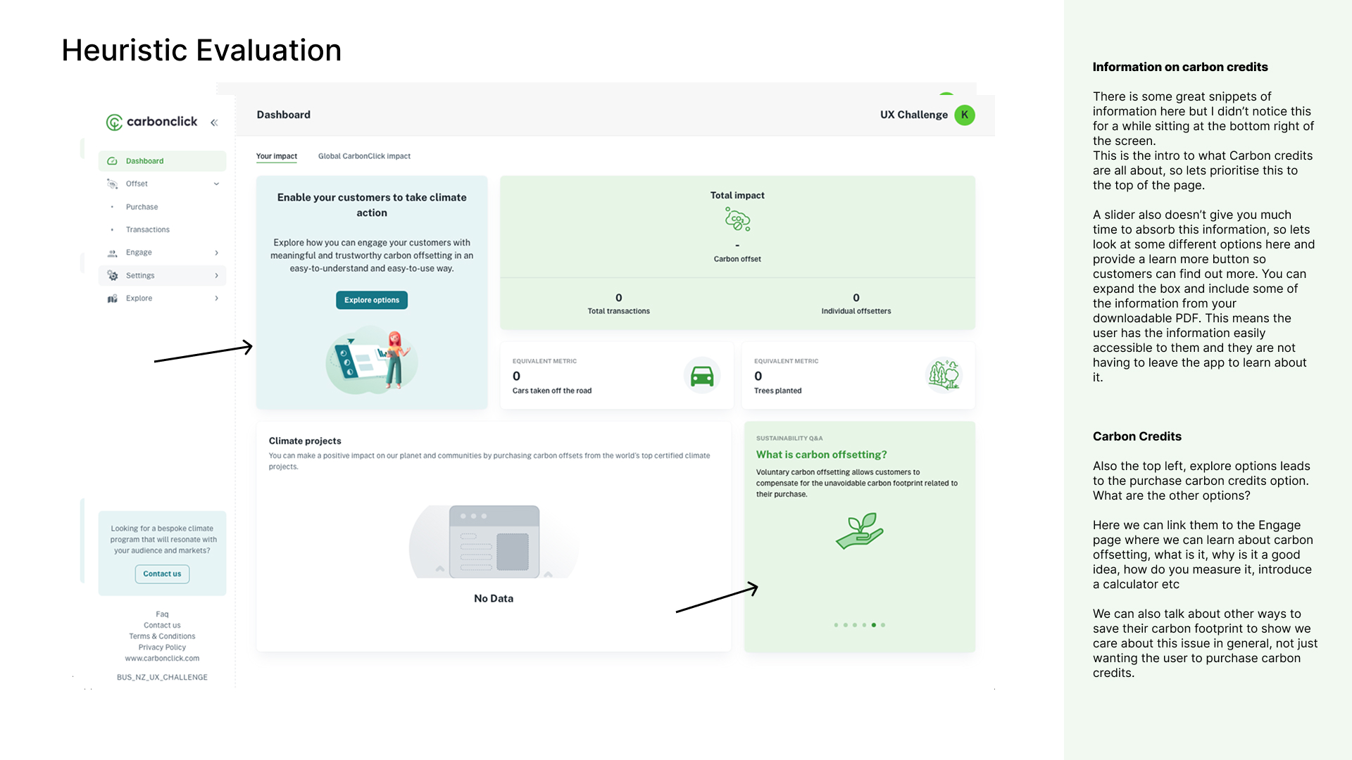
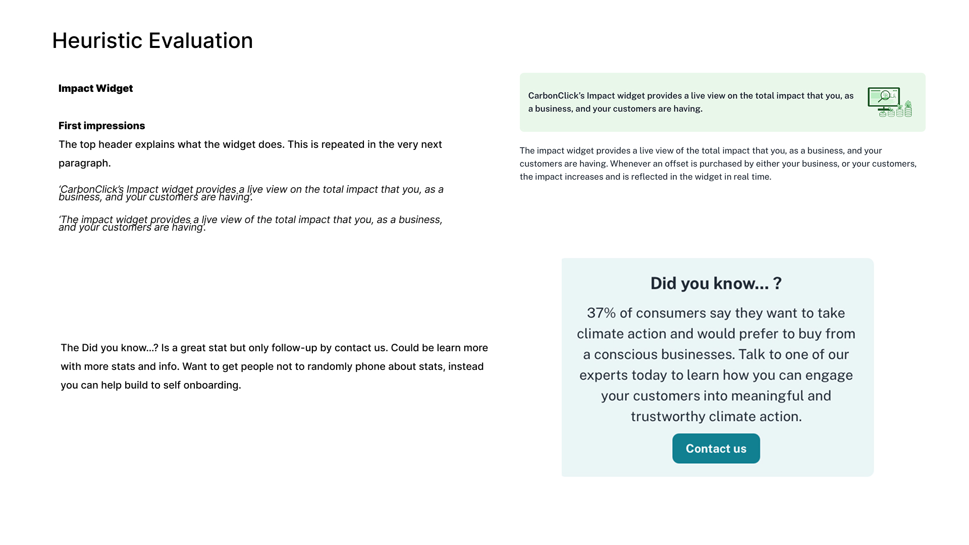
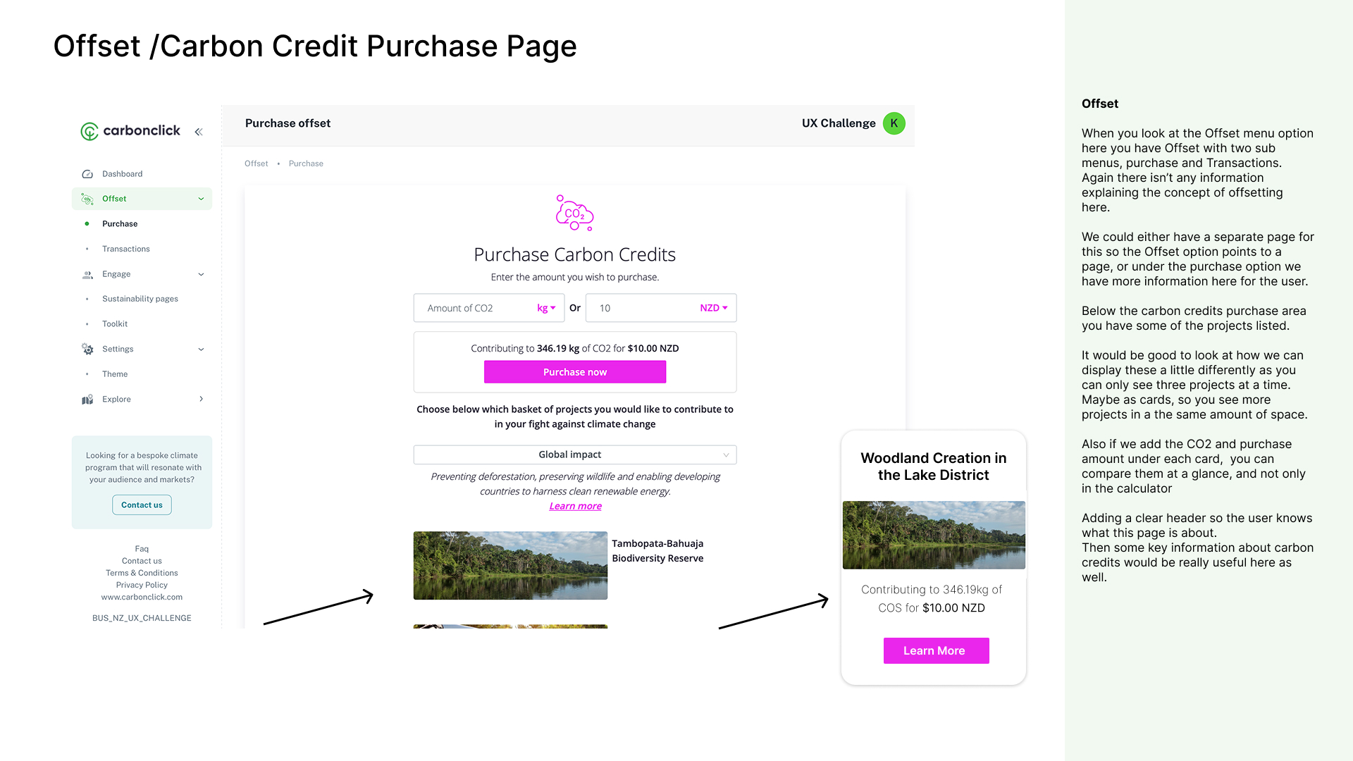
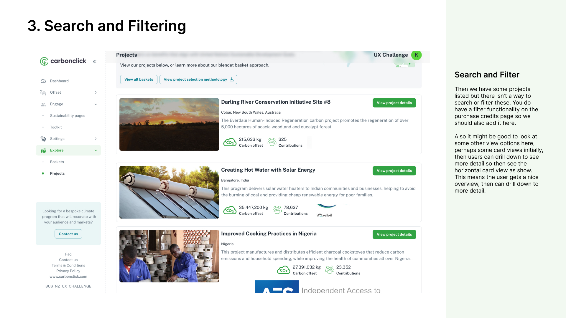
I conducted a heuristic evaluation of Carbon Click's app and these were some of my key findings.
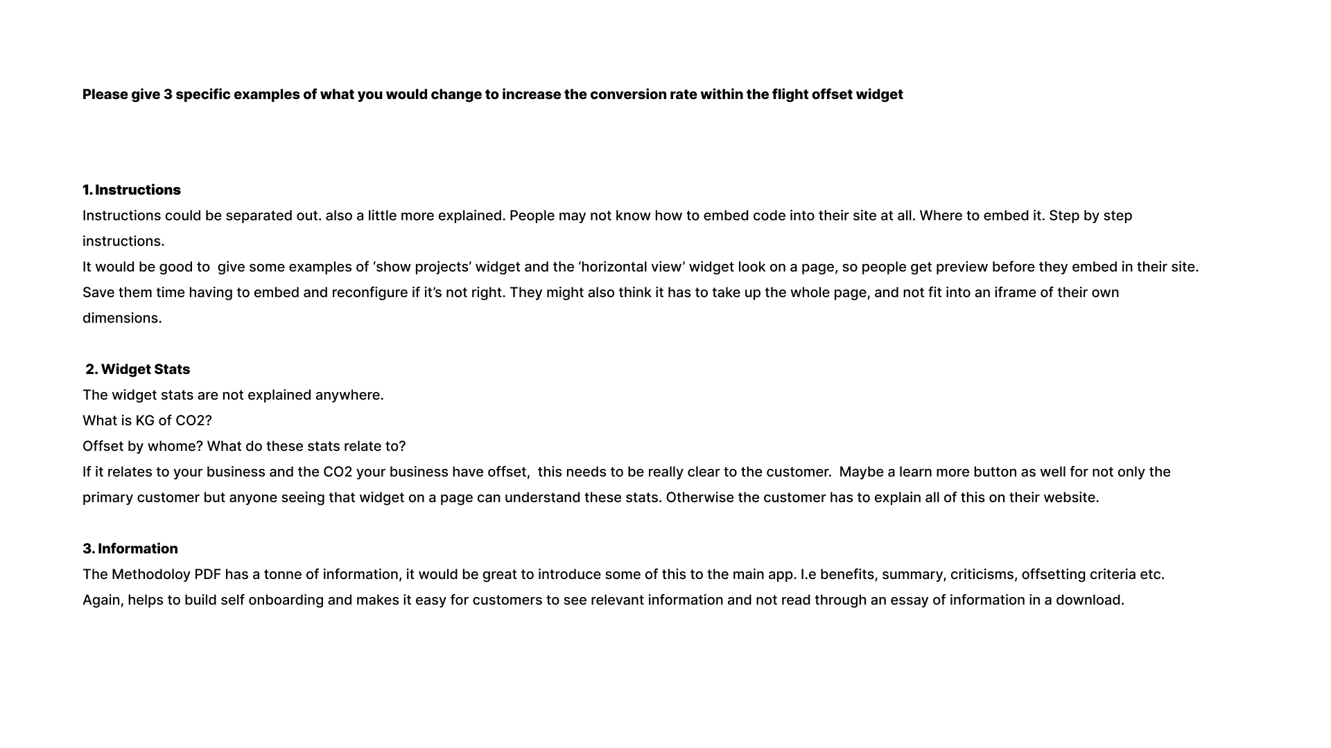
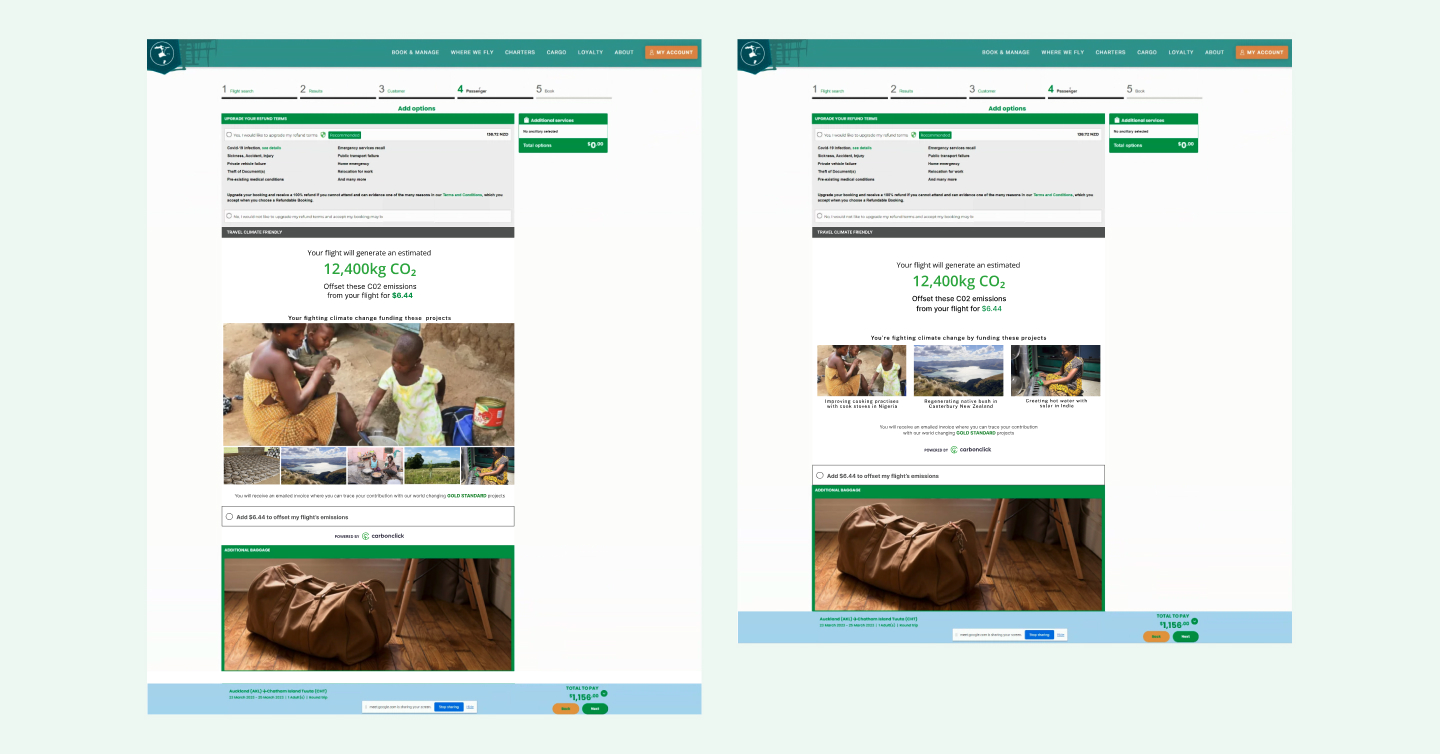
1. Instructions needed to be better explained for users. There were assumptions about what users knew about widgets and how to implement them.
2. Key statistics were not explained anywhere. What is KG of CO2? Offset by who? If these metrics related to a customers business, this needed to be really clear to the customer.
3. Carbon Click methodology was stuck in a downloadable PDF. Although this had a tonne of information, this information needed to be better integrated into the website, i.e benefits, summary, criticisms, offsetting criteria etc.
This helps to build self onboarding and makes it easy for customers to see relevant information and not read through an essay of information in a download. I went through each page and noted what worked, what needed reviewing and why.
ideating/solutions
How might we?
CarbonClick's subscription model had a known retention problem: plans weren't delivering enough ongoing value to keep customers engaged past the first few months. Content and social resources had been identified as part of the solution but never built.
I proposed bundling social media kits with the core product: story frames, post templates, and banner ads across Instagram, Facebook, and LinkedIn. The rationale was practical: once built, the overhead was minimal, but it gave SMEs a ready-made way to communicate their sustainability story to their own customers. That reduced the ask on them and increased the perceived value of staying subscribed.The portal needed to shift from an admin tool to somewhere customers actually wanted to spend time. I proposed repositioning it as a content hub, with articles, tools, and resources tailored to SMEs building a sustainability narrative. At $99 per year, the barrier to entry was low enough to drive new sign-ups, while high-engagement content addressed the retention drop-off that had concerned previous investors.
The existing marketing led with CarbonClick's mission. The research told us customers needed to see their own goals reflected first. I reframed the messaging around what businesses gained from the partnership, clearer ROI, customer-facing credibility, and tangible proof of impact, rather than leading with CarbonClick's values.
Workshops and Figjaming
Workshops covered pricing plan restructuring, payment journeys, product pillar definitions, and customer onboarding blueprints. Running these in FigJam gave stakeholders a shared canvas to contribute to and react in real time, making the outputs faster to align on than traditional documentation.
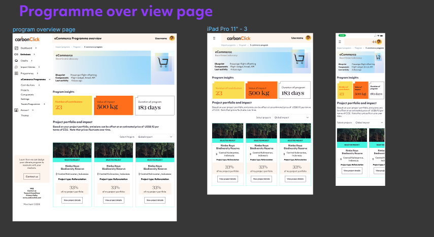
mid-fidelity wireframes
Wireframing and Rebrand in Parallell
CarbonClick was mid-rebrand when I joined. Rather than waiting for the brand to stabilise before designing, I ran both workstreams simultaneously, wireframing new program structures while progressively integrating the incoming brand, one component at a time, to avoid disrupting what was already in production.
prototype / High fidelity wireframes
Interactive Prototyping for devs
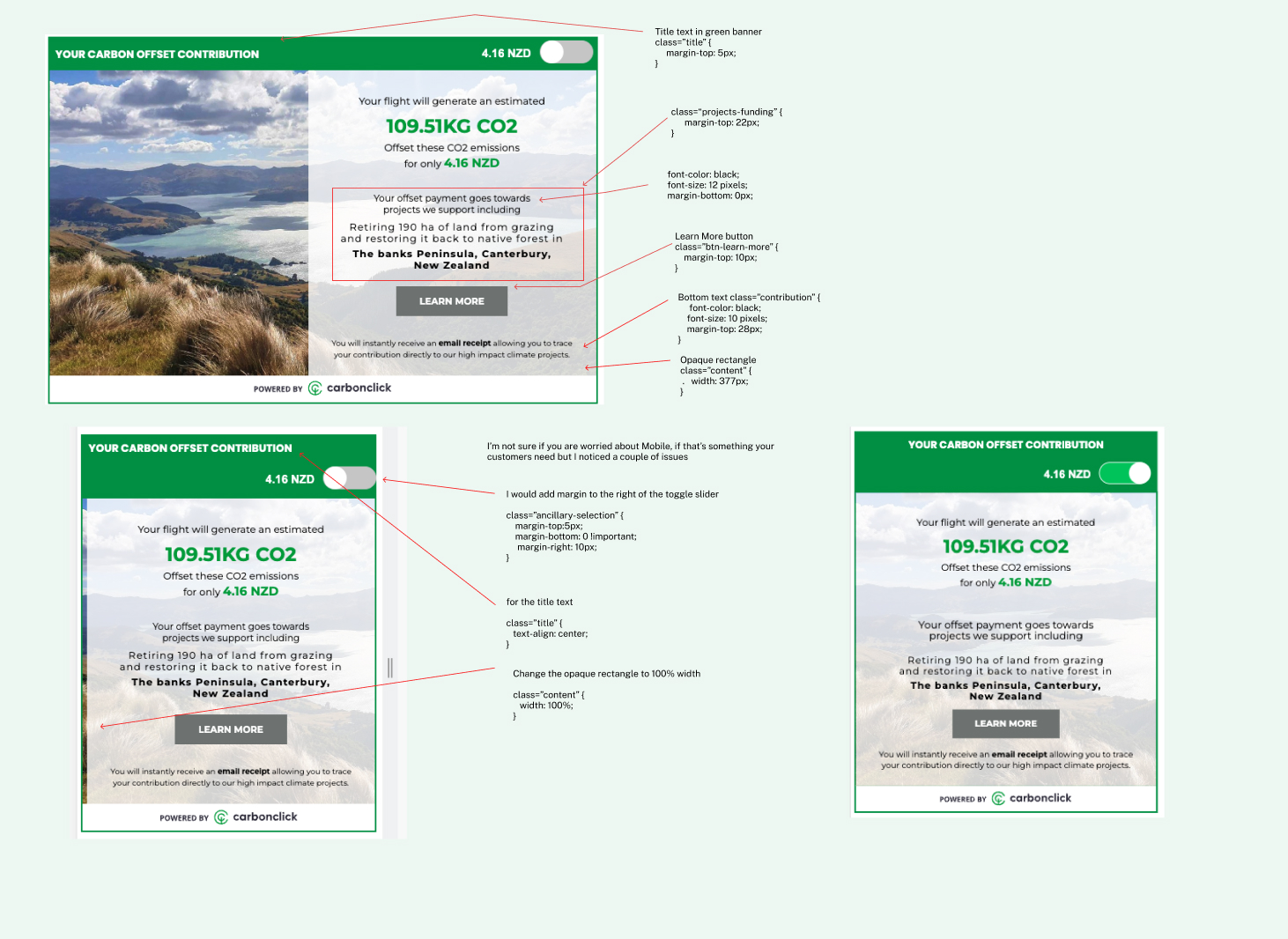
I built Figma prototypes for all key micro-interactions for engineering. This replaced lengthy written specifications in Jira with something engineers could watch and reference, cutting back-and-forth and reducing misinterpretation during development.
Reflection & COntinuous improvement
Key Learnings
• Sustainability products live or die on trust. Every design decision either builds or erodes it.
• Behaviour change needs both emotional resonance and a frictionless path. Either one alone isn't enough.
• B2B2C platforms require genuinely distinct experiences for each layer of the value chain, what works for a business admin doesn't work for their end customer.
• Retention has to be designed for, not assumed. Engagement metrics need to be built into the product model from the start, not retrofitted.
What I would do differently
• Run user interviews in the first two weeks, not after internal alignment was complete. The internal picture and the customer picture diverged more than expected.
• Push earlier for A/B testing infrastructure on the key conversion flows.
• Instrument the dashboard from day one so engagement data could inform design decisions in real time rather than retrospectively.
styleguide
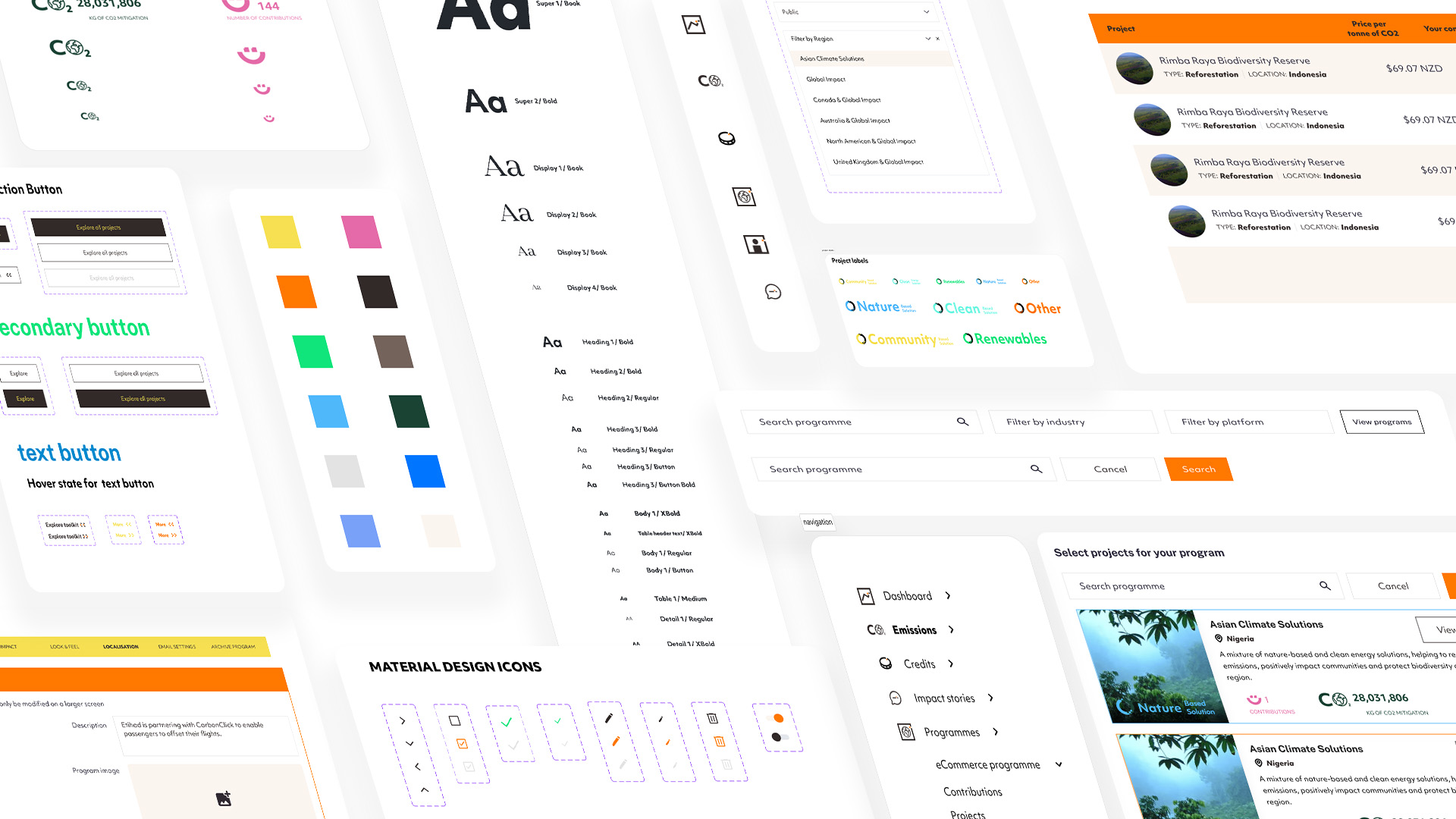
The front-end website had been designed by an external agency as part of a rebrand already underway before I joined. My role was to carry that brand into the product, ensuring consistency across the full customer experience.
I built a component library in Figma and worked through the rebrand gradually with the engineering team, one component at a time, starting with navigation and core UI elements, to avoid breaking what was already live.





.jpg)



.gif)
.png)